It has been quite a while since my last ‘Analyse A Real PPC Campaign’ so I thought it would be a good idea to do one in this article. In the last article of the series, I analysed Bing Ads’s PPC campaign who had used a rival’s pay per click program (Google) to spread awareness about their own pay per click program. Although this might sound contradictory at first, it is very clever because Microsoft are simply making use of as many PPC programs as possible to advertise their product and cover the widest spectrum of audience on the internet. In this article, I will be looking at Sainsbury’s PPC campaign on entertainment.
To view Sainbury’s PPC campaign, I had to type into Google, ‘buy music online’:
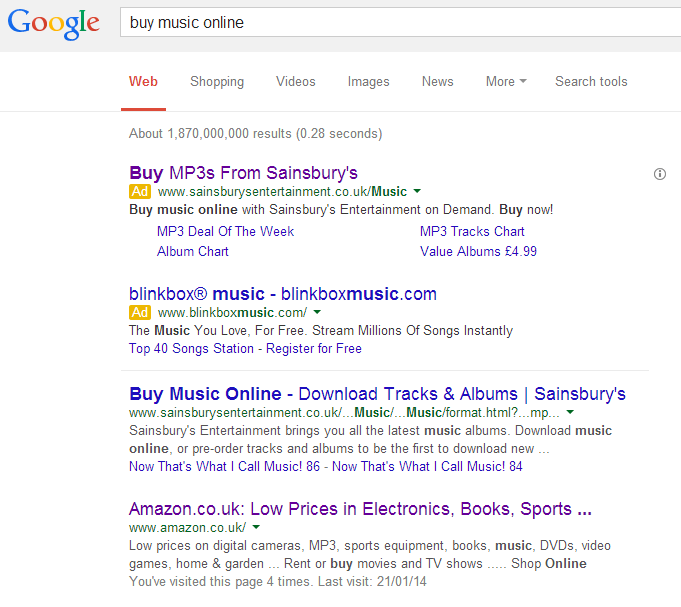
What is most interesting about this advert is the fact that it is there. Amazingly, Sainsbury’s Entertainment is ranked organically number one: ahead of Amazon, iTunes, Napster, Spotify and more. Therefore, why would Sainsbury’s feel the need to create a PPC campaign for such a keyword where they are #1 organically already? The main reason is most likely due to the PPC competition from blinkbox. If Sainsbury’s chooses not to run a PPC campaign, blinkbox will have the top spot in PPC easily without any competition.
Looking at the advert itself, it is effective in the sense that:
- It has three call to actions (one in the title, two in the description) giving the web user instructions on what to do. This will result in a likelier conversion.
- There are links below the advert to other areas of Sainsbury’s Entertainment, giving the web user the opportunity to go to the pages s/he wants to go to without having to go through the landing page first.
- The advert is short, snappy and easily digestible – web users will have little reason not to read the advert.
After clicking on the advert, I came to the following landing page:
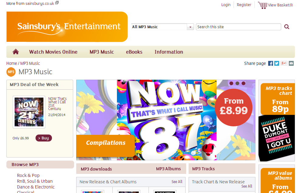
Continuing the orange theme that the Sainbury’s brand is associated with, the landing page is well designed with lots of bright colours and images to keep the web user’s attention. Remember that images are a great way to display lots of content in an easy to digest median.
Every landing page should have a menu bar which has links to different areas of the website. Looking at Sainsbury’s menu bar, it only seems to have four links, which, when you think of it, is not a lot at all. But, in actual fact, when the mouse hovers over one of these four links, a whole selection of other links drops down into a sub-menu. With these type of menu bars, they do save space and enable lots of links to be stored onto the landing page giving the web user more choice to what page s/he should click onto next. However, at the same time, the prejudice look to these menu bars are that they do not have the link I want to click on and that could turn web users away from staying on the landing page. If you can, stick with a traditional menu bar with no hovering effects for drop down links as you are making the web user have to discover the drop down menu to click onto a more relevant web page to the web user’s interests.
Will Green
Will created Ask Will Online back in 2010 to help students revise and bloggers make money developing himself into an expert in PPC, blogging SEO, and online marketing. He now runs others websites such as Poem Analysis, Book Analysis, and Ocean Info. You can follow him @willGreeny.
|
Recommended posts
|
