The last PPC campaign I analysed in the ‘Analyse A Real PPC Campaign’ series was from the release of the OnePlus 5T on O2, where it was found that the search advert was well designed. However, the landing page had both positives and negatives to conclude on for the overall effectiveness of the PPC campaign. With December approaching quickly, now is the time of year that people start to look to decorate houses and buy the right lighting for the Christmas season. With this, here is an analysis of a PPC campaign from Festive Lights.
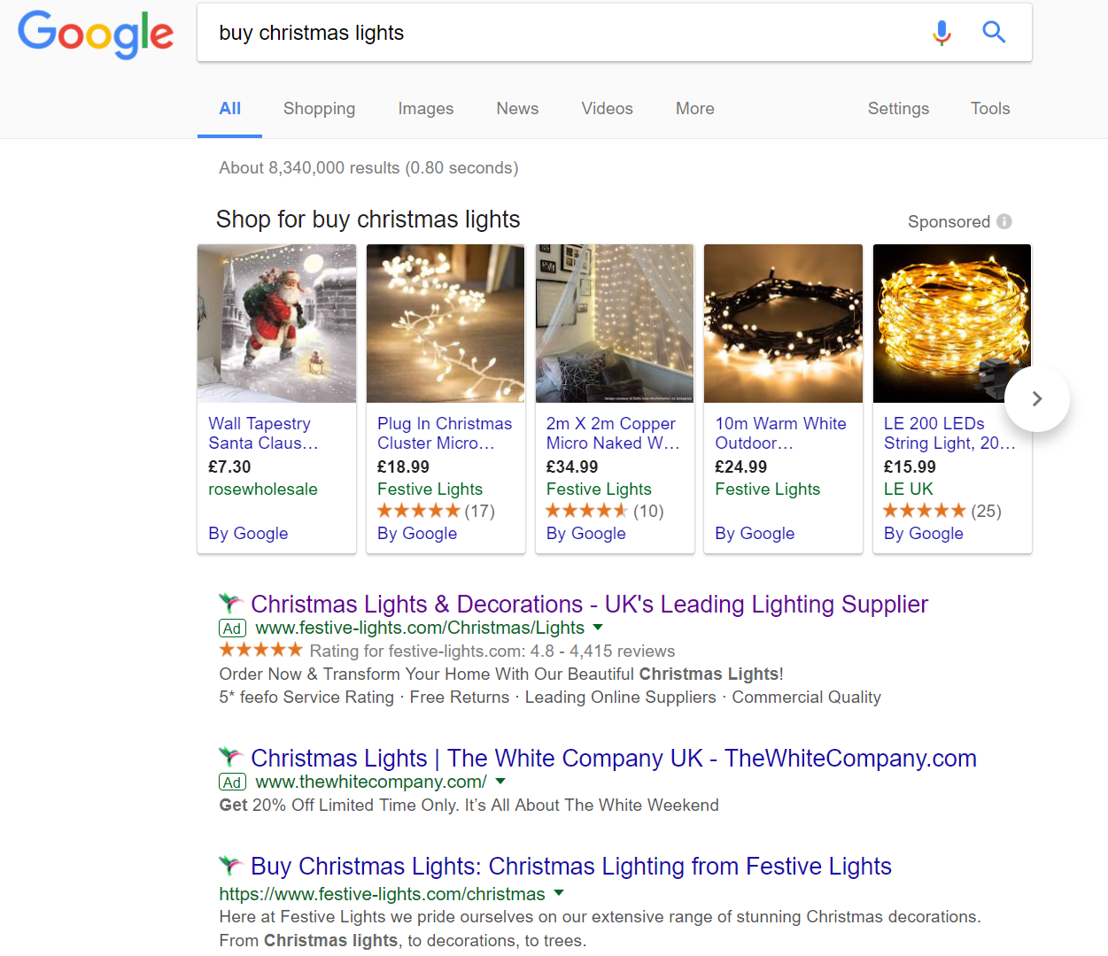
To view Festive Light’s PPC search advert, I had to type into Google search UK, ‘buy christmas lights’: Straight away, the competition for such a search phrase is high. Although the four spaces of PPC are not filled, the fact there is sponsored shopping results will push people away from PPC, as opposed if it was not there. What is extremely interesting is that Festive Lights have two adverts appearing for this search phrase, which is a first for this series. With each advert, the landing page is also exactly the same. Now, why would Festive Lights do this?
- To gain more traffic. If the top advert does not get the click, it is possible that a slightly different advert will come across better to the web user and get clicked on.
- A/B testing – although it is not strictly A/B testing as, from this, it is clear the higher ranked advert will do better.
- To crowd the competition. By having two adverts from Festive Lights against the one from The White Company, the chances of a click onto Festive Lights adverts is greatly improved.
This is a very interesting approach for which I think advertisers can take advantage of. There is no real downside to this (except the CPC might slightly increase) since only one advert can get a click so Festive Lights will only pay out once between the two campaigns.
After clicking on the above top advert, I came to the following landing page. For a landing page selling Christmas lights, I was expecting the theme to be more ‘Christmassy’. For example, the lack of any red in the theme makes the page quite minimalist. After all, Christmas lights for houses are all about being seen: bright and colorful. To some extent, the landing page should reflect the product it is selling.
Putting this aside, the navigation menu expands upon hovering, which is a necessity for modern PPC landing pages with lots of options for the web user to explore. The ‘rule of three’ is used below the navigation menu to entice the web user into converting with Festive Lights. As well as this, some of the pictures appear just below the fold, encouraging the web user to scroll down to see the range of Christmas Lights Festive Lights have on offer.
If this landing page was more festive, I would have said this was a very good landing page. However, it is lacking the Christmas spirit, for which people crave when it comes to shopping for things such as Christmas lights – it is not just about buying the product but the experience of buying such a product which is also important.
You must be logged in to post a commentLogin