The last PPC campaign I analysed in the ‘Analyse A Real PPC Campaign’ series was from Vimeo, who had the only paid search advert that was competing against a rich snippets organic result. When landing onto the landing page, it was quite bland and had many areas of improvement.
For the UK, this week commences the week where most punters bet on horses. It is the Cheltenham Festival which is also a time bookmakers profit significantly from. With this, here is an analysis of one bookmaker, Betfair, and their PPC campaign around this time.
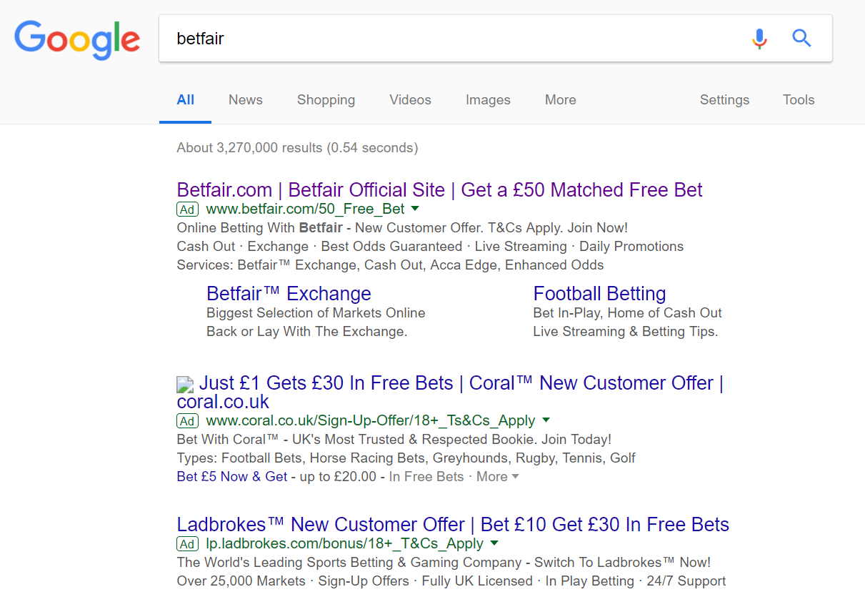
To view Betfair’s PPC search advert, I had to type into Google search UK, ‘betfair’: Betfair have a paid search for their own advert, which makes sense considering the competition there is for their own brand name. Coral and Ladbrokes are both trying to capitalize and lure web users into signing up with their own betting shops rather than Betfair. To counter this, Betfair have had to pay the highest CPC to rank number one, and use the site link extension to further increase exposure levels for their advert.
The only potential problem I can see is that Betfair have looked at this PPC advert as a way of targeting new customers, and not existing customers. It would be interesting to see the ratio of new customers to existing customers that click onto the advert.
After clicking on the above advert, I came to the following landing page: Continuing the discussion from the search advert, there is a button for existing customers to click onto if they landed onto this page for new customers (the Login button in the top right). This will help not allow existing customers from getting frustrated from landing onto a page not specifically designed for them.
Looking at the landing page as a whole, it is a very good example of a well optimized landing page:
- The colour scheme Betfair have used links in with the brand image. What they have cleverly done is make the boldest colour the £50 to make clear the offer they are giving to new customers – this is clear from the fact the kits that the players are wearing are very dulled down in terms of colours. The same point applies to the bright white font as well.
- An image on a landing page can often paint a thousand words that content simply cannot do. From having three icons from three different sports makes clear to the web user they can bet on any sport they like.
- Betfair have included their brand image twice on the landing page, solidifying their brand awareness to the web user.
- Betfair have been good at using different size fonts to dictate what content the web user reads first. By making the offer the largest, the web user is likely to read it first, with the terms and conditions of the offer the smallest (and less likely to be read, since it is not gripping and will not work to keep the web user on the page and contribute to a conversion: lead capture).
You must be logged in to post a commentLogin