The last PPC campaign I analysed in the ‘Analyse A Real PPC Campaign’ series was from Virgin TV, who had created an effective advert to advertise their new TV box, to encourage both new and existing customers of upgrading.
An extremely competitive market can be said to be the banking industry. With this, looking at credit cards, here is an analysis of a PPC campaign from American Express.
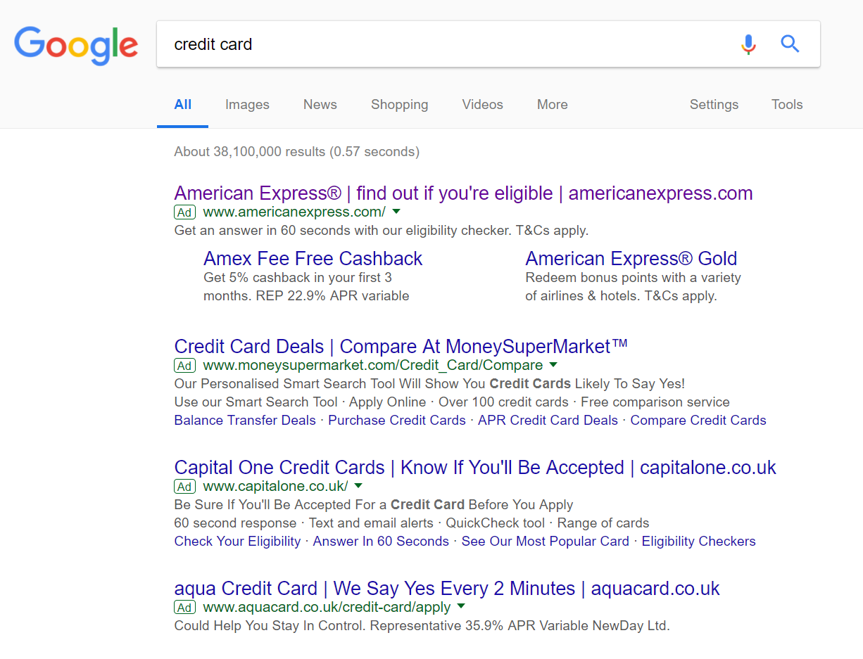
To view American Express’ PPC search advert, I had to type into Google search UK, ‘credit card’: Straight away it is made clear that, as predicted, this is an extremely competitive keyword, with the maximum of four adverts appearing. This makes clear that for American Express to get #1 spot of paid results, they must have paid a very high CPC.
The advert structure, in some sense, is actually very similar to the main competition (spots 3-4), where American Express start with their brand name, a call to action, the domain name and a description which expands on the call to action. I like what American Express have done with the addition of site links extension. More contextual links for one advert generally results in a greater chance of a click, as well as increasing the exposure level of the advert more, on the whole too.
After clicking on the above advert, I came to the following landing page: In general, this is a good landing page, with pros and cons associated to it:
- The obvious link to click in orange illustrates that this is a click through landing page. However, if the sole reason of this landing is to get a click onto another page, then either:
- The link could be made clearer and brighter.
- Send the web user straight to that page, since there is no point selling American Express if the web user is not firstly eligible.
- The rule of three (with regards to enticing the web user in) is an effective way to encourage the web user with pointers as to why they should convert for you – American Express have utilized this technique just below the first ‘Check your eligibility’ button.
- The click through button lands onto a lead capture page. Without the enticement to get web user’s into wanting to check their eligibility with enticements such as from the rule of three, the web user may have lost attention and not been bothered with filling in the form.
- The problem I have with this landing page, though, is the bland colour scheme. Nothing is making me want to stay on this page, even if the content is enticing or interesting – brighter and more vibrant colours are needed to maintain the web user’s attention.
You must be logged in to post a commentLogin