
The last campaigns to have been analysed in the ‘Analyse A Real PPC Campaign’ series was from JollyChic, Made In Europe and Marks and Spencer. The reason for analysing all three was because each campaign had, what I felt, serious flaws in them which would have severely affected the success rate of each respective campaign (and from noticing these flaws, can help stop other advertisers making the same mistakes). In this article, I thought I would look into a market that is always going to be saturated with adverts because when traffic does convert for this sector, the results produced are worth £thousands. Here is an analysis of Tesco Bank’s PPC campaign.
To view Tesco Bank’s PPC search advert, I had to type into Google search UK, ‘bank loan’: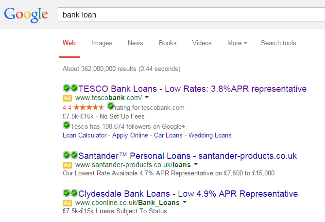 There are a few things I can point out from looking at Tesco Bank’s search advert:
- To get top spot on paid results for such a crucial keyword search phrase makes clear Tesco Bank have paid a lot for this position. It is even possible their CPC will be in the tens of pounds considering the highest paying keywords in Google AdWords was ‘insurance’ at $55 and then ‘loans’ at $44.
- The advert uses two ad extensions being the site link and rating extensions, which make clear to web users that Tesco Bank are valued highly by others.
- However, there is no call to action anywhere in the advert. To entice the web user further, I always feel adverts need at least one call to action even if it is just two words ‘Try now’.
After clicking on the above search advert, I came to the following landing page: For some reason, my first impression of this landing page is that it scares me. There is a lot of small print that should come with bank loans and, to me, the landing page seems just that bit too clean and minimalistic – I want to know every detail about a bank loan before I ask for one.
It is a scroll through landing page. I can see that to view the rest of the information you need to scroll down. However, it is not as obvious as it could be. Tesco Bank could have an arrow to guide traffic down the landing page.
As well as this, there is actually a button that says ‘Apply’ just below the fold of the page. Does this make it an infomercial page or a click through page? I am not sure. If it is an infomercial, is has many areas to improve. If Tesco Bank wanted people to click onto ‘Apply’, why did they have it below the fold of the page? This does not makes sense since there is tons of space to still be used above the fold of the page.


