The last campaign I analysed in the ‘Analyse A Real PPC Campaign’ series was from ieuanthelionshop.co.uk, who had created a good search advert but suffered some drawbacks when it came to their landing page for which did not utilise the main central area the web user would first look at. With the Olympics in Rio, Brazil, just starting I thought to do an analysis that reflects this worldwide sporting event kicking off. Therefore, without further ado, here is an analysis of a PPC campaign by ticketbis (who sell tickets for the Olympics in Rio).
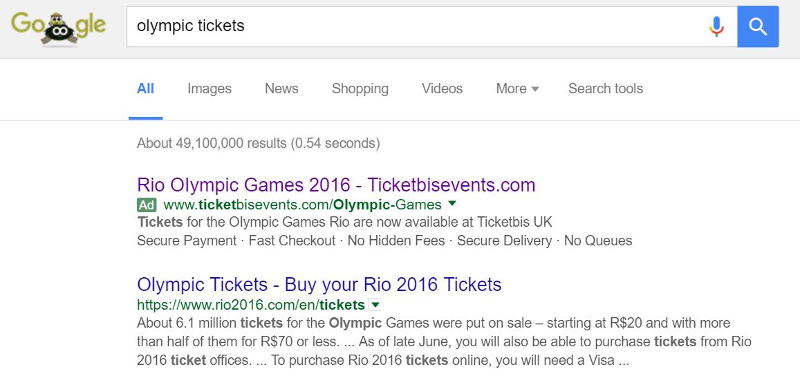
To view ticketbis’s PPC search advert, I had to type into Google search UK, ‘olympic tickets’:
Looking at the advert itself, it adopts the ‘brand name promotion’ strategy for which I recently spoke about in one of my previous articles. This is an effective structure to mention the URL of ticketbis in the title as well as addressing exactly what I searched for at the start of the title too. The description is full of information too. However, they are missing a call to action which would make their search advert just that bit better.
Considering a call to action can be as simple as two words (e.g. Buy now!) or as long as a sentence, there is not an excuse to not put a CTA somewhere in the description of an advert: especially if there isn’t a call to action in any other part of the advert.
After clicking on the above advert, I came to the following landing page:
The idea to have image thumbnails representing each event is good. I like the idea of grouping all of the events to high top categories and upon each click, the choice in thumbnails to choose from become more defined and specific until you find the event for you. Although this route will mean the web user will have to click two or three times to get to the page they want, it will potentiality be much quicker and better looking than the landing page ticketbis have used.


