Everyone loves infographics, especially when they are used by web sites or blogs and result in a massive amount of viral traffic. The reason why infographics are great, is that people love to see things visually and not have to read. This is exactly what infographics do… they make it easy for any topic or stats to be read, while also being entertaining in the process. However, not all infographics are created equal and having a bad one can result in little return on investment and even hurt your company or brand in the long run.
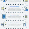
Let’s take a look at the infographic below, which was created by Infographic Design Team. It’s a great looking design and makes a somewhat uninteresting topic, quite interesting.
Typical Mistakes People Make Creating Infographics
- Choosing the wrong colors
- Copy ideas from other infographics
- Make the infographic tough to share
- Present too many numbers in a small space
- Using an excel sheet in your design
What Makes Your Infographic Data Bad
- Misleading or downright wrong data
- Wikipedia as the only source
- Outdated information (more than 12 months old)
- Non interesting topic
- Bad spelling and grammar
Do continue to read and view the infographic below for the best practices when creating infographics of your own.
Created by Infographic Design Team

You must be logged in to post a commentLogin