The last PPC campaign I analysed in the ‘Analyse A Real PPC Campaign’ series was from Opun, who had a good search advert and a brilliant example of a landing page, especially after the poor landing page previous to that was from Aviva.
The stock market is something that I am sure a lot of people take note of, if that is about staying up to date with shares/stocks people have bought or to see potential shares/stocks to buy/sell. It’s a big market for companies to introduce people to trading with shares/stocks and would be an interesting sector to analyse a PPC campaign from. For this reason, here is an analysis of a PPC campaign from markets.com.
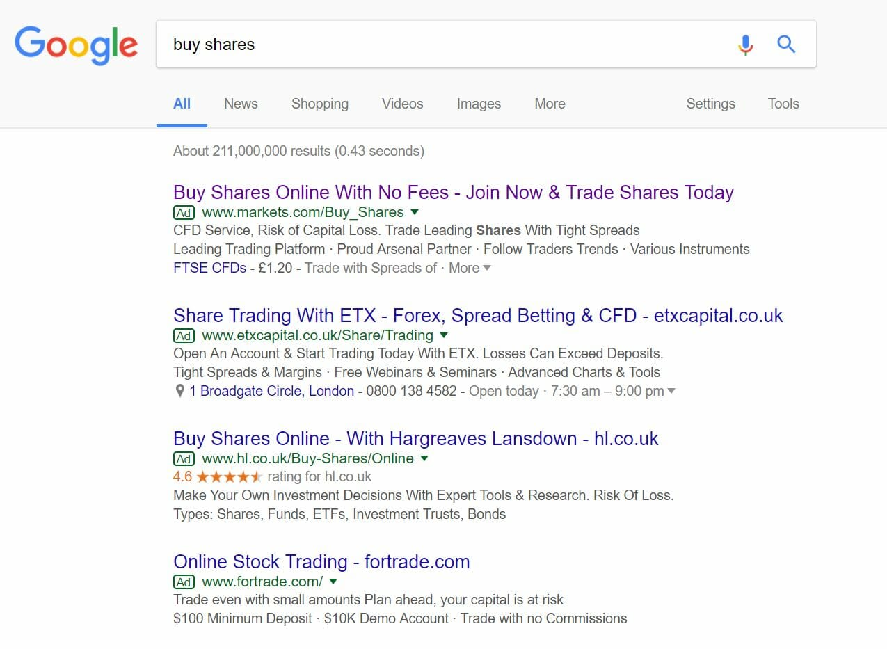
To view markets.com’s PPC search advert, I had to type into Google search UK, ‘buy shares’: The competition for this search phrase is high, with the maximum of four adverts appearing in the paid search results section – this makes it clear that the CPC markets.com have adopted is high, with a quality score that would have been higher than the adverts below it.
Looking at the advert itself, it is a great advert for the following reasons:
- The title is brilliant. It addresses the search phrase and includes two call to actions – this is helped by the fact that the search phrase, itself, is a call to action as well.
- The description adopts the approach of saying lots in as little space as possible. Some adverts like to use full sentences in the descriptions which, to some extent, the competition have done in the above image. Markets.com chose to cram in as much information as possible, which I think works: it goes to show that markets.com has a lot of features around buying shares and knows quite a lot about too.
- There is an ad extension for this advert, which seems to be a site link extension with a drop down specific for shares. This enables those who understand CFD shares to see the first figures involving certain company CFD share prices.
After clicking on the above advert, I came to the following landing page: This is a great example of a click through landing page, made clear from the large blue ‘Start Trading Now’ button in the bottom left of the landing page. Below are the main points about this landing page:
- As with click through landing pages, there are further enticements to get the web user to sign up (after clicking on the click through button). This is listed to the left hand side of the landing page which is typically where web users read first on a web page.
- The image used is a great example to include on the landing page, illustrating numbers and the devices that can be used with markets.com.
- The navigation menu, although does not have an expansion upon hover feature, has many links in it for which the web user will find useful, since they all relate to the stock market.
- The center area is actually a timed slideshow, so that more information could be shown to the web user to further entice them.
You must be logged in to post a commentLogin