The last PPC campaign I analysed in the ‘Analyse A Real PPC Campaign’ series was from Aviva, who had a great search advert that had a high ranking and used ad extensions to make it easier for the web user to see and engage with the advert. However, the campaign was let significantly down by the landing page, which was bland to look at and lacked an image to convey the message Aviva wanted to portray of their pension scheme.
In the series, we have not looked at anything with a conversion sale price of more than ~$1,000. For this reason, here is a look at a market which, if it converts, will generate thousands in revenue. Here is an analysis of a PPC campaign from Opun, that undertake house extensions.
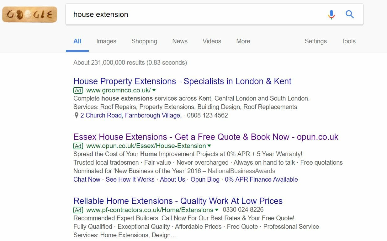
To view Opun’s PPC search advert, I had to type into Google search UK, ‘house extension’: It is interesting that only three adverts appear for this search phrase, of the four maximum spaces in paid search. This gives the impression that possibly:
- Competitiors are not keen to use PPC for this market due to poor performance.
- The work required to create a good PPC campaign is not something that many contractors of house extensions have or are willing to outsource.
Looking at Opun’s advert, they have used two extensions to further improve their advert. The review extension adds confidence to the web user since the contracting business is notorious for ‘cowboys’. As well as this, the site link extensions used are diversified and allow the web user to see a whole range of different web pages on Opun’s website, which will help to increase to the CTR of the advert.
The title of the advert is also very good. They have adopted a structure of ‘[addressing the search phrase] [call to action] [domain name]’. This is a very good structure to go by to achieve a healthy CTR and promotes the domain name for direct traffic.
It is also clear that the advert has been well targeted. It is unlikely contractors will travel far for something such as a house extension. Therefore, it is clear the geo-targeting has been used correctly by Opun since they have identified the county I was based in when searching on Google.
After clicking on the above advert, I came to the following landing page: At the start of this article, I spoke about the poor landing page of Aviva’s since they did not use an image. Straight away, you can see how visually stunning this landing page is from the correct use of a background image that is related to the campaign. This is a brilliant landing page from Opun with the following good points:
- The navigation menu does not expand upon hovering. However, it is large, easy to read and the three horizontal lines to the right indicate the possibility to expand the menu, which everyone will be use to from them first being implemented onto smartphones.
- After a time period, the Live Chat box expands with an actual person requesting if they can help me in any way – having human contact as soon as possible on a website is definately a massive positive, especially with something as important as a house extension.
- It is clear this is a lead capture page, from the large bar at the bottom of the website, which is animated to illustrate what the web user needs to do – this is a very effective way to get the web user to convert the way Opun wants them to.
You must be logged in to post a commentLogin