The last PPC campaign I analysed in the ‘Analyse A Real PPC Campaign’ series was from OnePlus to promote their new flagship smartphone of 2017: the OnePlus 5. What we found with this PPC campaign was that the campaign was implemented to point those looking at the OnePlus brand to their new smartphone, since the top organic search result for ‘OnePlus’ points web users to the homepage and not the product page of the OnePlus 5.
Pensions are something that everyone has to think about at one time or another, to ensure a financially stable retirement. With this in mind, here is an analysis of a PPC campaign from Aviva.
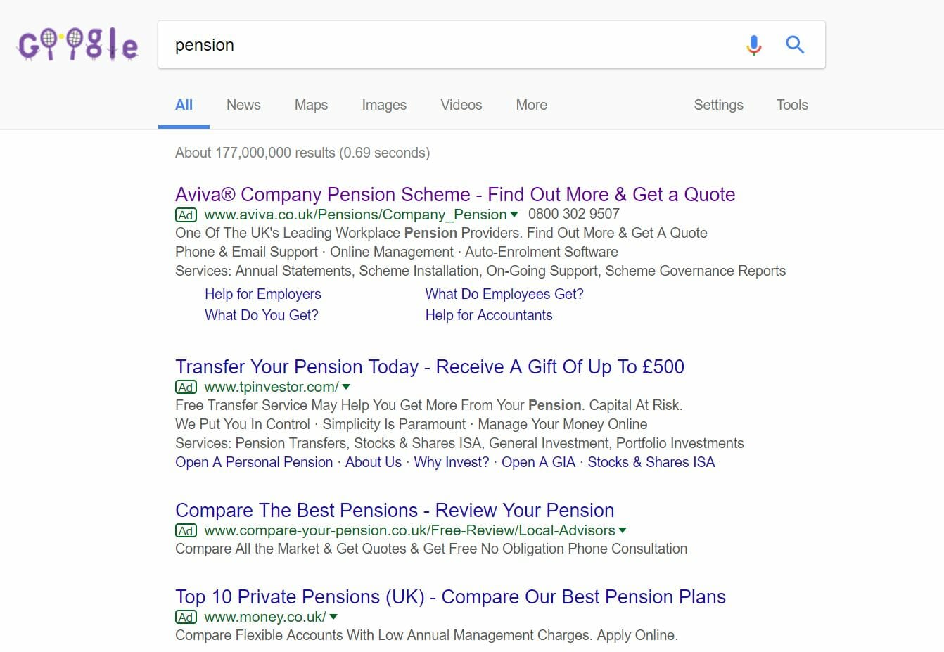
To view Aviva’s PPC search advert, I had to type into Google search UK, ‘pension’: ‘Pension’, as a keyword search phrase, is going to bring with it a huge CPC – Aviva have done very well to rank number one on paid results for this reason. However, the keyword targeting strategy could be improved to make the campaign run more cost efficient and, potentially, better.
The problem is that one word or vague search terms generally do not go into enough detail for the advertiser to fully understand what the web user wants. This is made clear through the Aviva advert – the search term ‘pension’ could apply to searching about any type of pension. Aviva’s advert is too specific for this, looking at just a company pension scheme.
Putting the targeting aside, there are many positive points to this advert. For one, it is packed with information, the Aviva brand and utilised the site link extension to further increase the CTR of the advert.
After clicking on the above advert, I came to the following landing page: First impressions of this landing page are not the best, to be quite frank. Here are the main pointers about this page, which I assume is a click through landing page based on the yellow and white buttons in the bottom left:
- The colour scheme for this landing page is a bit boring and not very appealing. I understand the yellow is from the Aviva logo. However, the turquoisey green is a bit horrible to look at.
- As a click through landing page, the choice of location and size for the buttons to click onto is poor. It is generally a good idea, for click through landing pages, to locate the button/s to the middle right, with the reasons to click onto them to the middle left.
- There is a lack of images on this landing page. It would have been far more beneficial to the performance of this landing to have had the turqoisey green colour removed and replaced with a large detailed image of something applicable, such as an old couple enjoying doing something which costs money (where they could afford it because of the pension through Aviva).
The last point is particularly critical. Images can talk a thousand words to the web user and the lack of a single image on this landing page really does not entice the web user on first impressions.
You must be logged in to post a commentLogin