The last PPC campaign I analysed in the ‘Analyse A Real PPC Campaign’ series was from Club Med, who followed a typical approach, with regards to the structure and content, of a search advert, with a landing page that was well designed, mainly due to the action-shot image used.
A market that is always healthy and in demand is the scented candle, with many people buying such items to help them relax and create an ambiance in their homes. With this, here is an analysis of a PPC campaign from Wiff.
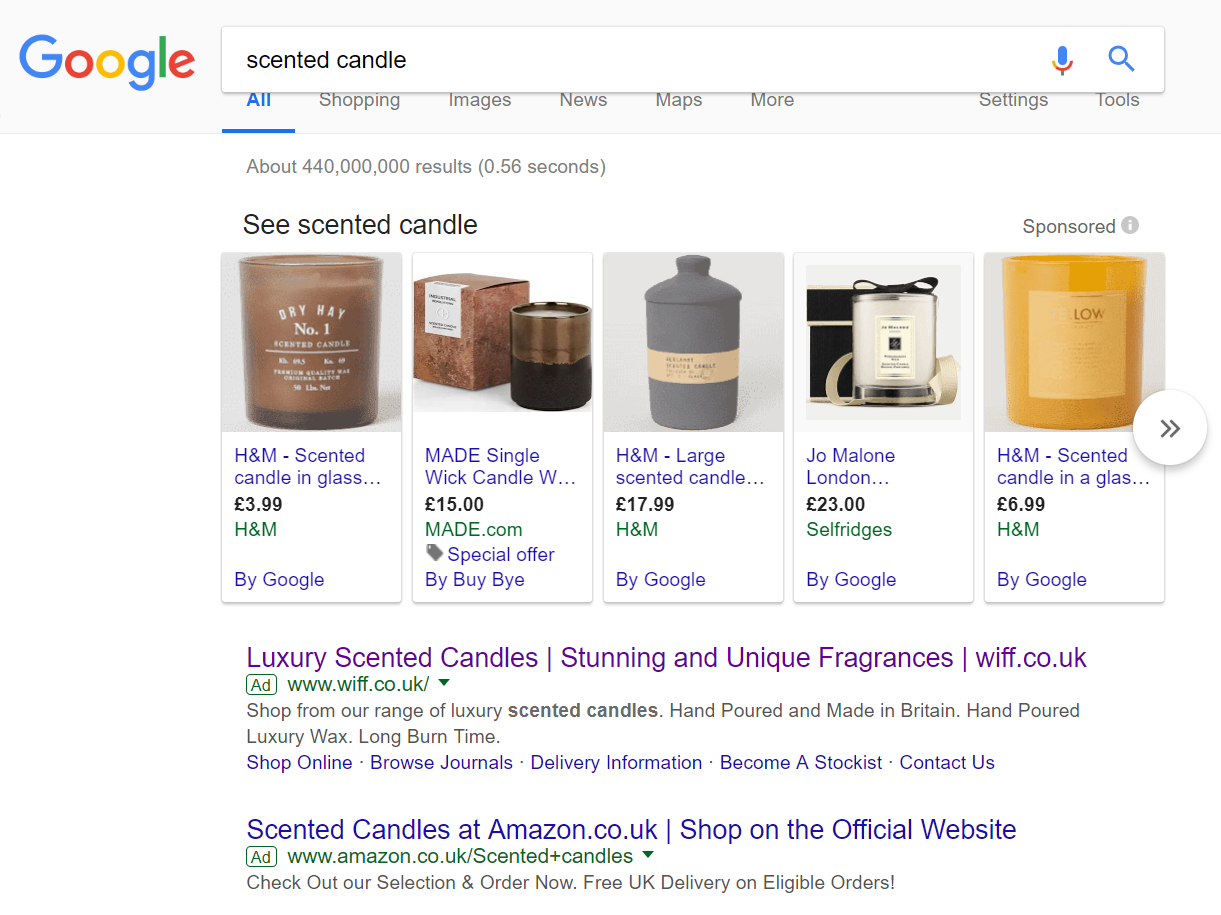
To view Wiff’s PPC search advert, I had to type into Google search UK, ‘scented candle’: Straight away, it is clear Wiff are going to have a tough time gaining a good CTR with this advert. Google shopping sponsored results are always going to have an advantage because:
- They include images, for which makes the item come to life and become more ‘buyable’.
- They include prices, for which main consumers want to and like to see.
- They are on the top spot of paid search results, which naturally gains the most exposure.
Couple this with Amazon below, which is also going to gain a good CTR, and Wiff are sandwiched quite badly for this search phrase. To combat this, it would be advisable to use more ad extensions (with them already using the site links extension). Ad extensions help expand the advert, making it larger in size to help gain the advert more exposure. The content of the advert increases and helps the CTR of it, by providing more information and opportunities of links to click to the web user.
Forgetting how they are located against the competition, Wiff’s advert is actually very good. The title is very ‘to the point’, includes a URL for direct traffic and uses power words such as ‘Stunning’, ‘Unique’ and ‘Luxury’ to make Wiff candles sound that bit better. The description contains a good amount of reasons to buy a Wiff candle, starting with a CTA. All in all, apart from the lack of more ad extensions, this is a good search advert.
After clicking on the above advert, I came to the following landing page: This is a really good landing page, although my one criticism is the fact we cannot see a candle above the fold – it would have been beneficial to have images of the candles next to the boxes, or just the candles, to give the web user an idea as to how the candle looks (since the aesthetics of candles plays an important role in selling them too). Forgetting this, there are many good points to this landing page:
- The navigation menu is very simple and minimalist, keeping the attention to the middle of the landing page, which is where Wiff wants the web user to look.
- The boxes the candles come in do look good – this is something that people will like, especially if they are buying for a gift.
- From showing a range of candles, Wiff have also shown the range of scents they have. They are very unique scents, which provides the incentive to explore the range, to see what other scents Wiff offer with their candles.
- The ‘Shop Now’ button makes clear this is a click through landing page, with it being the largest font on above the fold too.
Ultimately, this landing page is a great example of showing just enough information to entice the web user further into exploring the range of products Wiff have to sell.
You must be logged in to post a commentLogin