The last PPC campaign I analysed in the ‘Analyse A Real PPC Campaign’ series was from Ocado, who had targeted shoppers of Waitrose to use Ocado for home delivery. There was a lack of Waitrose branding on the landing page of Ocado’s, which might have put people off using Ocado if they are unsure that they are shopping at Waitrose with them. As well as this, Waitrose offered home delivery too, making it difficult for Ocado to lure people into using their service over Waitrose’s.
Around this time of year (coming into the winter season), it is common for people to start looking for skiing holidays, as the mountains gradually get more snow on them. With this, here is an analysis of a PPC campaign from Club Med.
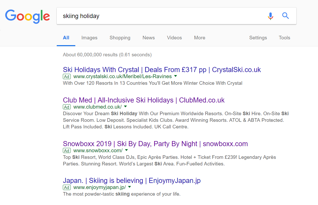
To view Clud Med’s PPC search advert, I had to type into Google search UK, ‘skiing holiday’:
Looking at the ad copy, it follows a good structure that can be, pretty much, used for any type of PPC search advert. This involves:
- Title: Address the web user’s search phrase| domain name
- Description line 1: Call to action to encourage a click
- Description line 2: Short sentences/phrases highlighting reasons to click onto the advert
- URL: domain name (same as what is mentioned in the title)
Talking very vaguely, adopting this structure will tend to produce good results.
After clicking on the above advert, I came to the following landing page:
- It is a minimalist page on purpose to emphasis the main image. This is achieved by hiding the navigation menu under the three horizontal lines in the top left, with it expanding to the left, similar to most apps for smartphones.
- The image is huge and takes up the majority of the page above the fold. This is a really good idea to do, so that the web user can start to imagine being the people skiing in the image if they were to buy a holiday with Club Med – large images like this get web users into the mood of wanting to do what’s in the image.
- The largest text on this landing page is readable but blended into the image (All inclusive ski holidays), highlighting exactly what is on this landing page, if the web user scrolls down the page.
- Since there are little to no links above the fold, there is only one option but for the web user to scroll down the page. This is an effective way to get the web user to do what you want for a landing page (follow the process of taking in the information above the page, before scrolling down as this is what the advertiser wants the web user to do).


