The last PPC campaign I analysed in the ‘Analyse A Real PPC Campaign’ was from Panasonic for a new smart home speaker. It was a clever PPC campaign from Panasonic, with good keyword targeting and a generally good landing page to push those interested in Google Assistant speakers into purchasing the Panasonic speaker rather than the Google Home or other alternatives.
With summer just around the corner, many people will be looking to book holidays for the coming months. With this, here is an analysis of a PPC campaign from Travel Republic.
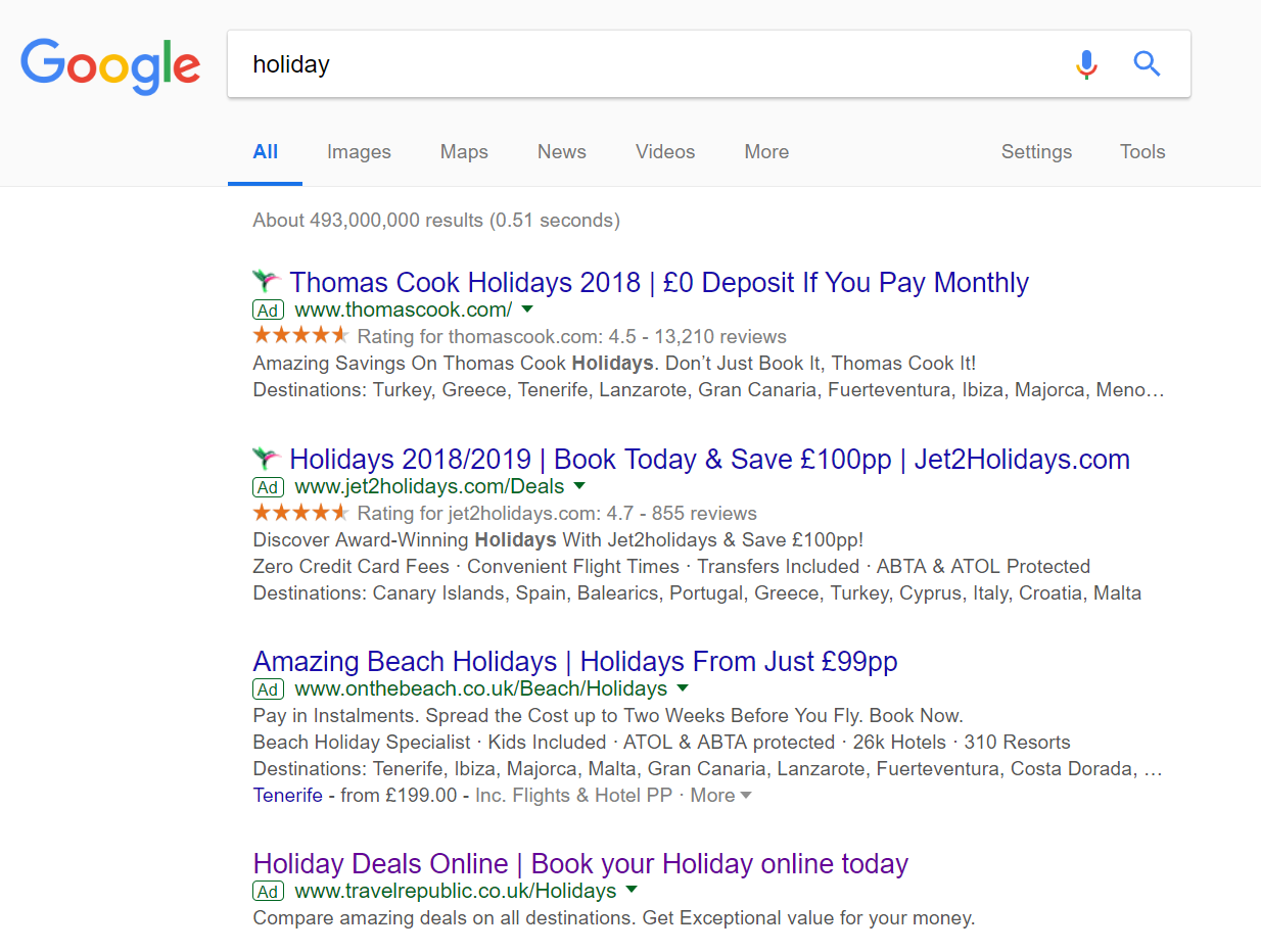
To view Travel Republic’s PPC search advert, I had to type into Google search UK, ‘holiday’:
There is strong competition for this keyword, and not surprisingly either. ‘holiday’ is a very generic term which will often result in people looking at holiday ideals and converting into a sale.
Straight away with Travel Republic, they are at a disadvantage with being ranked the lowest adverts in the paid search results. This could be due to a low CPC that Travel Republic have adopted. However, it is more likely that the quality score of their advert is not as high as the other three, which takes into consideration CPC, relevancy of the advert and more.
Looking at the advert itself, it is a poor advert due to the lack of ad extensions and a content heavy description used. Exposure of adverts are affected by the size of the advert. Therefore, the CTR of the advert will be affected since it looks generally less appealing, on a quick glance, than the adverts above it.
After clicking on the above advert I came to the following landing page:
As a landing page goes, it is okay (not amazing but not awful either). Here are the main points associated to the landing page:
- The colour scheme blends well with the logo of the advert. The blue helps to portray the ocean which, which is commonly associated with going abroad.
- The navigation menu expands upon hover. This helps to add more links to each of drop downs, such as destinations, offers and more.
- The landing page is very clean in how it looks, helping to reduce the bounce rate.
- The central area of the advert is a lead capture to see prices for holidays, based on what the web user puts in – it is clear, from this, that this landing page is a lead capture landing page.
- However, there is a surprisingly large amount of content, links and more below the fold of the landing page. Without content that is both above and below the fold, it is difficult for the web user to know that there is content below the fold, with the lead capture above the fold centrally located. it would have been useful to have an arrow or content partly above/below the fold so that the web user is aware of the extra content, to entice the web user further into buying a holiday with Travel Republic.
You must be logged in to post a commentLogin