The last PPC campaign I analysed in the ‘Analyse A Real PPC Campaign’ was from pay as u gym, who had a great example of a well designed search advert and landing page, resulting in a very effective landing page that would, no doubt, produce a high conversion rate.
In the past, we have had a look at TopCashback, a website about getting cashback when sales are tracked through their website. In this article, we will be looking at the competitor that, at the time, appeared second for the search phrase ‘cashback’: Quidco.
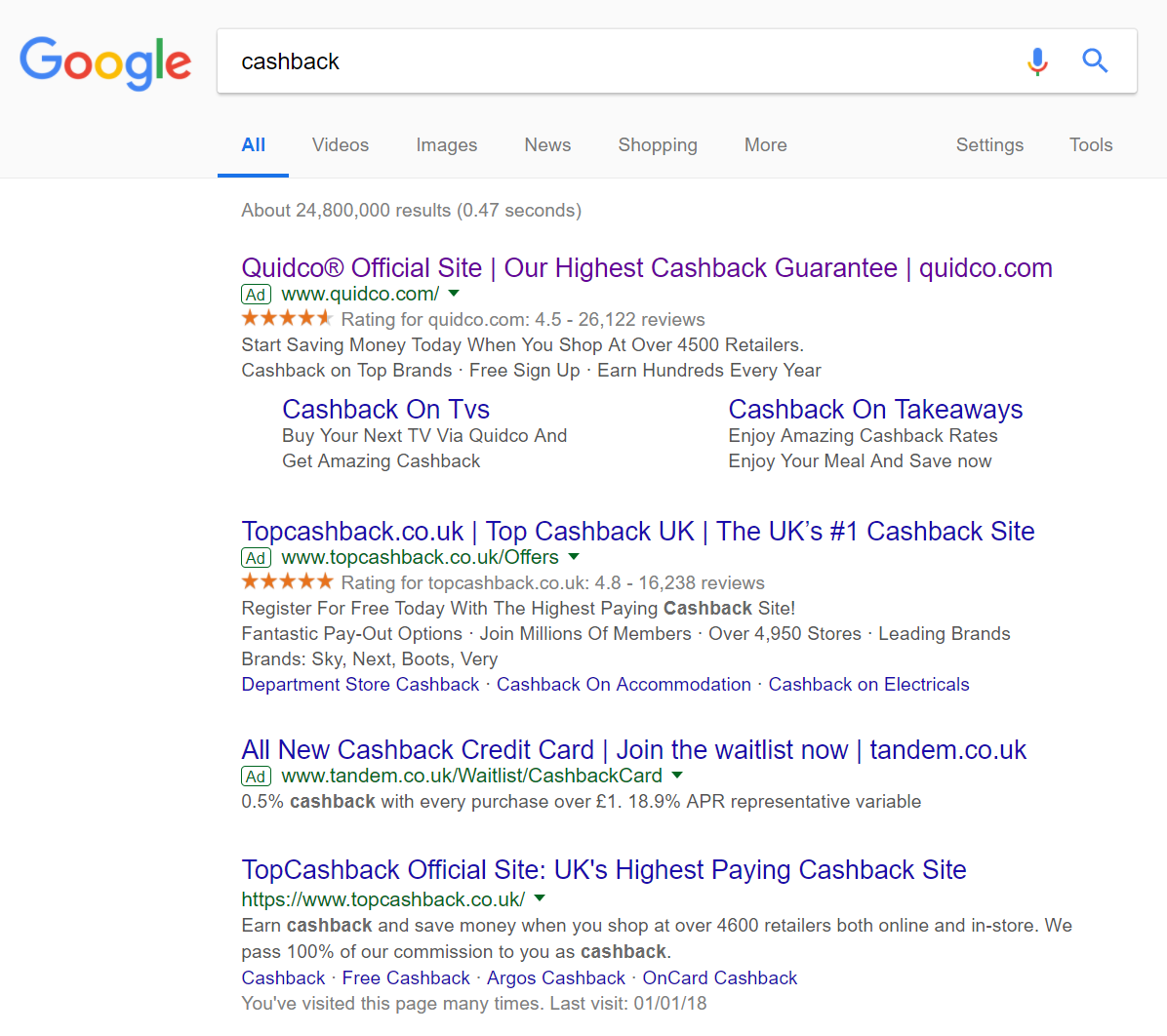
To view Quidoc’s PPC search advert, I had to type into Google search UK, ‘cashback’: In the past with this search phrase, it was TopCashback that managed to rank number one. However, considering they are organically ranked number one already, they may have reduced the CPC bidding as they may have felt they did not need to spend out big to get number one spot for paid search.
On the other hand, Quidco are ranked 5th organically. This is quite low for such a crucial keyword search phrase, providing good reason why Quidco has increased their paid search ranking to counteract their low organic ranking.
Looking at the advert itself, it is very similar to TopCashback’s advert, with the exception of the site links extension. This ad extension increases the overall space Quidco’s advert takes up, increasing the exposure rate of the advert to the web user. Including the URL at the end of the title will also help to increase brand awareness as well as direct traffic to the website. Overall, this is a good search advert.
After clicking on the above advert, I came to the following landing page: First impressions of this landing page are very good. The general layout, colors used and content is simple and easy to digest, reducing any chances that the web user clicks off this landing page within the first five or so seconds of landing onto it. Other good points to this landing page include:
- The top bar – The top section to the landing page is brilliant since it is very simple and clean:
- The Quidco logo is, of course, there to promote the brand.
- The search bar allows the web user to search for any merchant and get cashback whilst using them. What is special about this search bar, though, is the fact it automatically searches and takes the web user to a search page once the web user stops typing (so there is no need to press the enter bar or a ‘search’ button – less things for the web user to do on landing pages usually result in more conversions).
- The button to click onto is a different color to the rest of the landing page, making it stand out.
- The font sizes used are very clever, so that the web user reads the largest fonts first down to the smallest fonts. The smallest font on the landing page is the four pointers to using Quidco, which has been done on purpose as if the web user has not been won over yet, the four pointers should be the last thing the web user reads to entice them into using Quidco.
Overall, this is a very good PPC campaign.
You must be logged in to post a commentLogin