The last PPC campaign I analysed in the ‘Analyse A Real PPC Campaign’ series was from Travel Republic, who had a poor advert, with an average landing page – the problem was that the advert was very content-light, especially in the description. This would reduce the exposure level of the advert, coupled by the poor paid search ranking.
An industry that is struggling to keep up with technology is the book industry (although it is still a strong industry that should not die away any time soon). With this, looking at such an industry, here is an analysis of a PPC campaign from Oxfam.
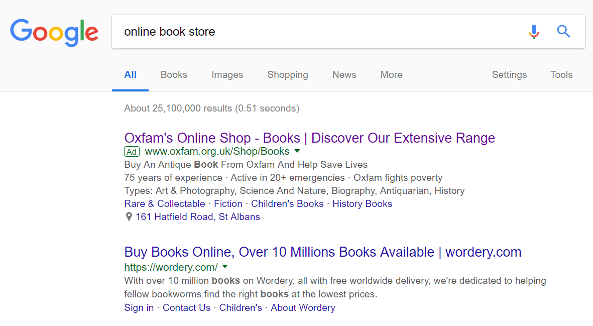
To view Oxfam’s PPC search advert, I had to type into Google search UK, ‘online book store’:
Regardless, the advert is effective for the following reasons:
- The title, straight away, addresses what the web user searched for. This is then assisted with a call to action at the end. Placing a few call to actions in PPC adverts has the benefit of potentially significantly increase the click through rate, since you are directly telling the web user what you want them to do (which they can achieve through first clicking onto the advert).
- Another call to action is placed in the top line of the description too.
- Oxfam have two ad extensions in their advert consisting of the:
- Site link extension – The links refer to different categories of books, which is a good idea, since the likelihood is that the web user will narrow down their search on the landing page to the category they want to read about.
- Location extension – Oxfam is a charity which means they have stores UK-wide with books for sale, donated by passers by. For this reason, adding the location of the nearest Oxfam store could entice web users to browse in the shop to find hidden gems people have donated.
After clicking on the above advert, I came to the following landing page:
This is a good landing page for the following reasons:
- The top of the website is dominated by a overly large search bar. This is a great idea for a book store, since it enables web users who know the exact book title of the book they want to buy.
- The use of the colour purple for the image is a good choice of colour. Purple is commonly associated as a rich and wealthy colour, making the book store of Oxfam seem a bit ‘classier’ and of higher quality.
- The navigation menu is brilliant, simply because it enables the web user to explore any part of Oxfam. Since Oxfam area charity, such a navigation menu will allow the full extent of products Oxfam have get the right amount of exposure through the navigation menu.


