The last PPC campaign I analysed in the ‘Analyse A Real PPC Campaign’ was from HSBC, who had an effective search advert, crucially ranking #1 of paid search results, considering there was a ‘People also search for’ box just below it. However, the landing page was a little disappointing, with areas that it could have improved on.
One sector that will always gain a healthy level of competition in PPC is the furniture industry: especially from the fact that a conversion can often be worth thousands. With this, here is an analysis of a PPC campaign from Marks and Spencer.
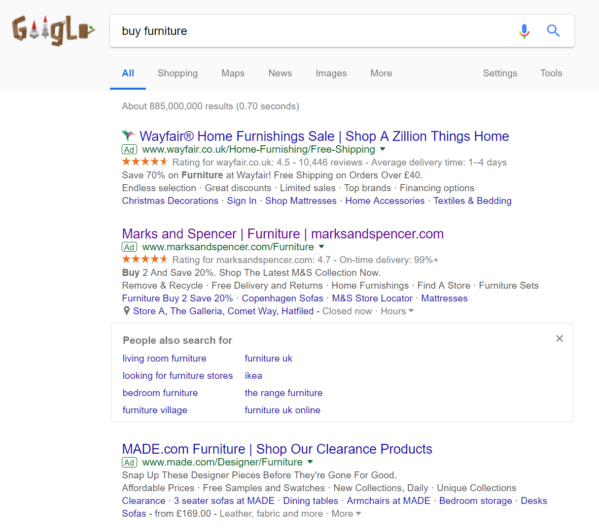
To view Marks and Spencer’s PPC search advert, I had to type into Google search UK, ‘buy furniture’: Three adverts of the maximum four appear for paid search results. What is different about these results, though, is the addition of a ‘People also searched for’ box, making the the two top positions gain more exposure than the third, which has been consequently pushed down the page. Such a box makes it more crucial to rank as high as possible in PPC, which will induce a bidding war amongst competitors – something Google won’t mind happening.
Looking at Marks and Spencer’s advert, it is well optimised for the following reasons:
- The title is effective at spreading the brand awareness of Marks and Spencer, attracting direct traffic, as well as addressing what the web user searched for.
- Considering the fact Wayfair used the ratings extension, it was clever for Marks and Spencer to do the same, since their rating is 0.2 higher than that of Wayfair, making M&S more appealing to the competition.
- The description and remaining ad extensions are packed with information and links for the web user to click onto, helping to increase the CTR of the advert.
- The use of multiple ad extensions will increase the size of M&S’s advert, increasing the exposure level of it further.
After clicking on the above advert, I came to the following landing page: There are both good and bad points to this landing page, outlined below:
- The navigation menu makes it possible for the web user to explore any part of Marks and Spencer’s website, although it does not expand upon hovering.
- The central area of the landing page is taking up with images of furniture and a discount, helping to entice web users into buying furniture with M&S.
- However, the landing page is quite bland in its theme, with only minimal colours used.
- As well as this, there is a lot of text on the landing page and not much content. The extra long navigation menu and sidebar clutters the page a bit.
- It would have been more beneficial to reduce the text on this landing page and increase the area that the image takes up, such as a living room with furniture all from Marks and Spencer.
You must be logged in to post a commentLogin