The last PPC campaign I analysed in the ‘Analyse A Real PPC Campaign’ series was from Alton Towers, who had targeted those looking for holiday packages during a specific week – May half term (for schools). The problem is that those that did not having children and still wanted to go away would have found the landing page just a tad childish for their liking, potentially reducing the chance of converting.
An area of PPC that will always have huge competition, and ridiculously high CPCs, is the baking industry. Looking at such a sector, here is an analysis of a PPC campaign from HSBC.
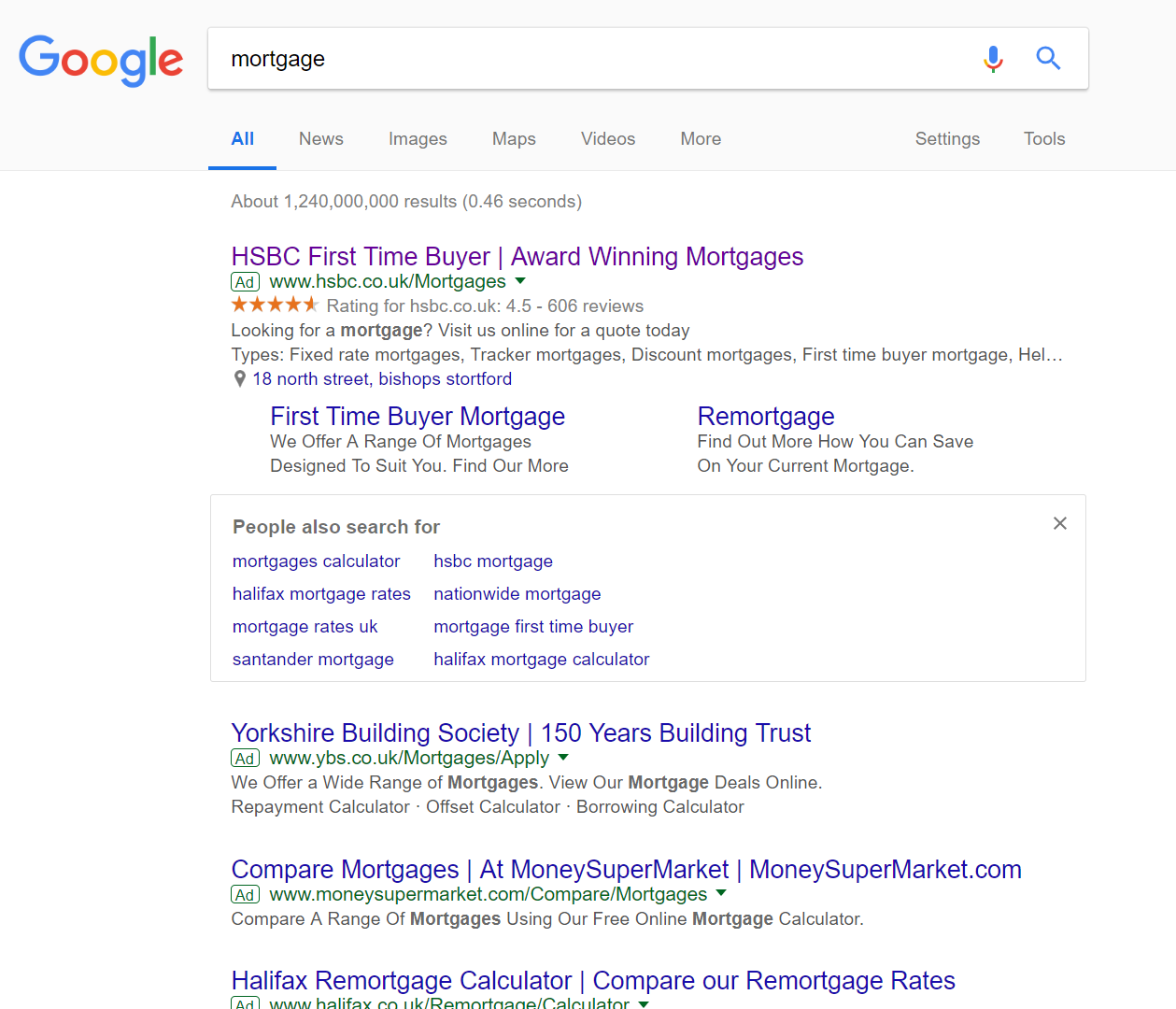
To view HSBC’s PPC search advert, I had to type into Google search UK, ‘mortgage’: What is most interesting about this SERP is the fact that Google chose to include a ‘People also search for’ right in the middle of paid search results. This will immediately make the number one spot of paid search results much more valuable, since it is separated from the other competition, providing it more exposure – this means it is particularly effective that HSBC rank #1.
Looking at the advert itself, HSBC have good content for a search advert, whilst utilizing the ad extensions on offer to increase exposure (through increasing ad size) and by providing more options to the web user:
- The location extension illustrates to the web user where the nearest branch is to them, encouraging the web user to explore mortgages with the sales team in such a branch.
- The site link extensions are large, with descriptions, providing more links for the web user to potentially click onto.
- The rating extension concurs with the ‘Award winning mortgages’, providing a positive brand image for HSBC regarding mortgages.
All in all, this makes the web user more likely to click onto the advert.
After clicking on the above advert, I came to the following landing page: After a positive search advert, this landing page is unfortunately the shortfall of this PPC campaign. Here are the main concerns with this landing page and the areas it can improve on:
- The colour scheme is very dull. Any other bank incorporates color into their website and landing pages in PPC. Just look at NatWest for a quick comparison.
- This is a click through landing page. However, it is not made clear at all.
- The content above the image links seems a bit unnecessary and clutters the landing page. It would have been far better to have colorful buttons for each type of mortgage, and then content and explanations regarding each mortgage on specific landing pages for each type of mortgage after clicking.
- There is no enticement on this landing page, such as why HSBC are ‘Award winning’. It would have been good to include a list of 2-3 reasons why people should use HSBC for mortgages, if they were to have any content on the landing page.
You must be logged in to post a commentLogin