The last PPC campaign I analysed in the ‘Analyse A Real PPC Campaign’ was from Tiffany & Co, for a Christmas campaign looking to capitalize on those wanting to buy gifts for family and friends. Although the PPC campaign was generally good on the whole, the element that let the campaign down was the vague keyword targeting, causing web users that might not be interested in buying jewelry landing onto a landing page to buy jewelry.
Straight after Christmas is a time of the year when there are some very large sales, to attract shoppers into continuing purchasing products/services. Looking at such a sale, here is an analysis of a PPC campaign from Lacoste.
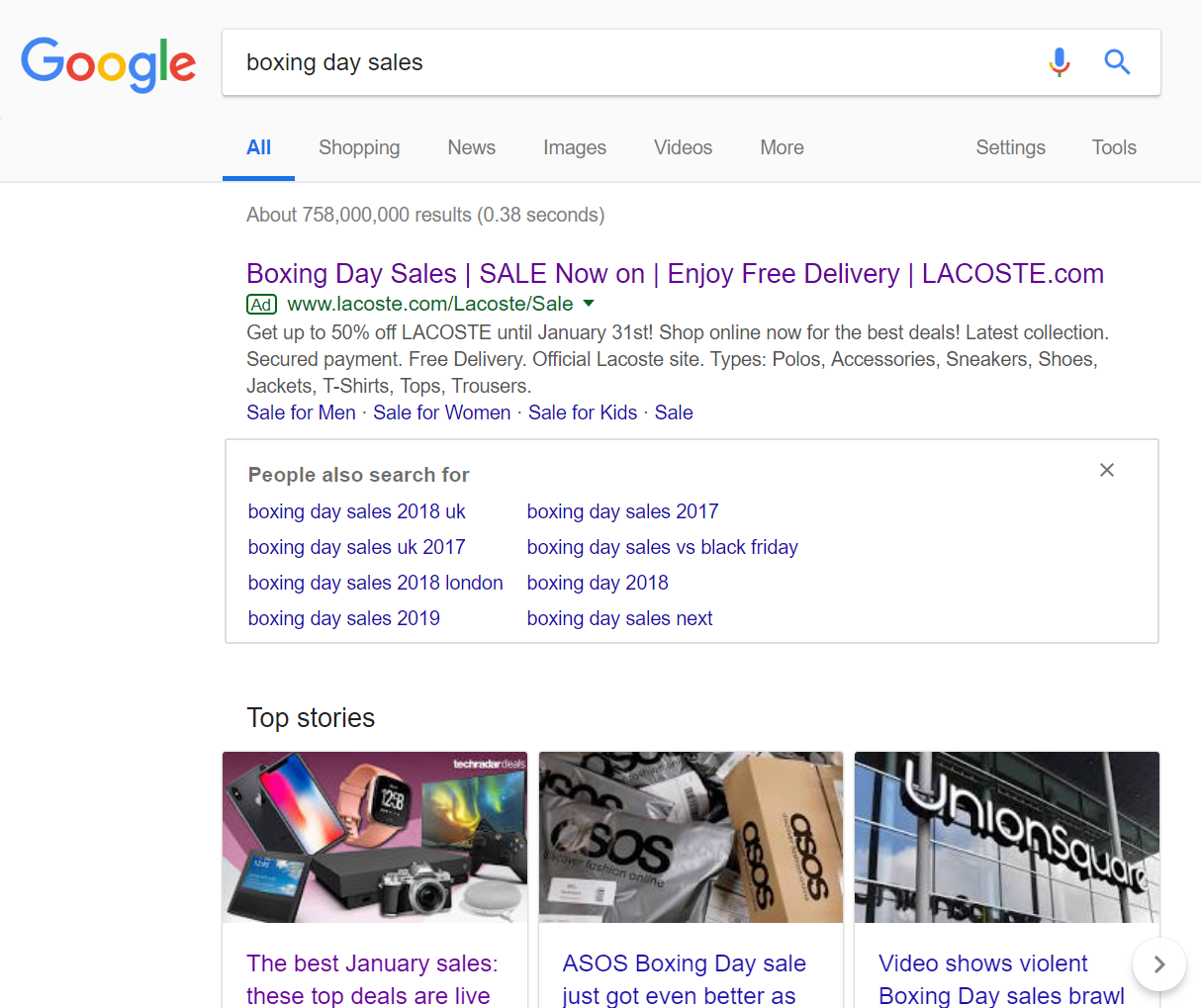
To view Lacoste’s PPC search advert, I had to type into Google search UK, ‘boxing day sales’: Amazingly, the competition for such a search phrase is not that fierce. This might be because there is enough promotion surrounding the Boxing Day/January Sales to not warrant funding a PPC campaign into PPC – many people choose their favorite retailers to check for sales automatically. This is also supported by the fact there are articles in the news that highlight the best deals in a list format – it is better to have good deals and get featured on news articles than pay for traffic through PPC for such sales.
Looking at Lacoste’s advert, they have chosen to go for a content heavy title to make clear of the reasons to shop at Lacoste during the sale. The density of the word ‘Sale’ is extremely high for this advert, which is exactly the way it should be. For a ‘sale’ advert, the brand name and ‘sale’ should be repeated a considerable amount of times, since the advert needs to only contain info regarding what the sale is, how much off is in the sale, and the brand name of what is on sale.
After clicking on the above advert I came to the following landing page: As a landing page goes, this is a very clean and minimalist landing page, in keeping with the brand of Lacoste and its fashion styling. The following are good points associated to this landing page:
- The largest font of the landing page addresses what the web user searched for ‘Winter Sale’. This will help to keep the web user onto the landing page.
- The actual products (images of clothing) appear slightly below the fold of the page, encouraging the web user to scroll down to see the remaining items in the winter sale.
However, the landing page is, by no means, perfect. Red is a typical colour used to illustrate sales. This is because it induces panic (from being the same colour as blood) and is brightly colored so can be seen easily. It could have benefited Lacoste to have used red for the sale sign, as well as for the pricing of the items below the fold of the page.
You must be logged in to post a commentLogin