The last PPC campaign I analysed in the ‘Analyse A Real PPC Campaign’ was from Zuto, who had a good search advert but had a landing page which lacked content that could have been placed on the page to entice the web user into a click, such as using the rule of three enticement. The furniture industry is an aggressive industry to be in with there always seemingly to be some sort of discount to get on sofas to lure people into purchases. Looking into this industry, here is an analysis of a PPC campaign from Harveys Furniture.
To view Harveys’ PPC search advert, I had to type into Google search UK, ‘buy sofa online’: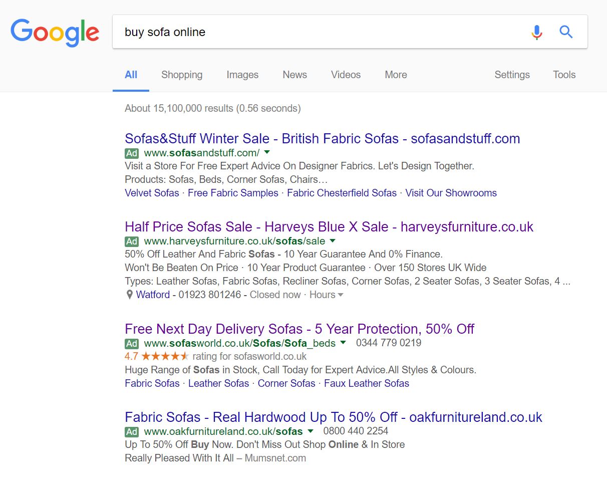 Straight away, the level of competition for this search phrase is evident at being very high from the maximum number of adverts appearing in the paid search results.
Looking at Harvey’s search advert, they have a great advert for the following reasons:
- The title includes their brand name, a mention of a sale and the domain name, to encourage direct traffic to Harveys’ website.
- The description goes into details with some quantifiable reasons why the web user should shop and buy at Harveys.
- There is the use of ad extensions to make the advert relate more to the web user. At the end of the day, very little people will buy a sofa without actually sitting on it to see how comfortable the sofa is. For this reason, it is a good idea that Harveys included the nearest store location to myself so, if I wanted to, I could see their range of furniture in person and ring the store too.
The only negative point to this search advert, I feel, is the third description, which clutters the advert a bit and is also a bit ‘over-kill’ in terms of content. Harveys does not need to go into detail about every type of sofa they have for sale – that should be done on the landing page.
After clicking on the above advert, I came to the following landing page: The landing page, from first impressions, is very mimimalistic which draws the attention to two areas of the page:
- The blue banner about the Blue Cross savings
- The images of the sofas themselves, which, apart from the blue banner, are the main bits of colour on this landing page
This is an effective way to get web users to look at what you want them to look at on a landing page: by adding the most colour to the areas you want them to look at on a minimalistic landing page.
From having the sofas appear half above the fold also gives the web user the enticement to scroll down the page to see what is below the fold. From doing this will get web user into the ‘jist’ of scrolling through pages of different sofas, which is what Harveys wants: for the web user to browse through the collection of furniture Harveys has for sale.


