The last PPC campaign I analysed in the ‘Analyse A Real PPC Campaign’ series was from Vauxhall, who had bid for their own brand name for two reasons and had a landing page which did have one or two areas of improvements.
The loan industry is a very popular market simply because it is extremely profitable: especially the short term loans. With car loans being ‘sort of’ short term loans, I thought it would be a good idea to look at a PPC campaign for a car loan. Therefore, without further ado, here is an analysis of a PPC campaign from Zuto.
To view Zuto’s search advert, I had to type into Google search UK, ‘get a car loan’: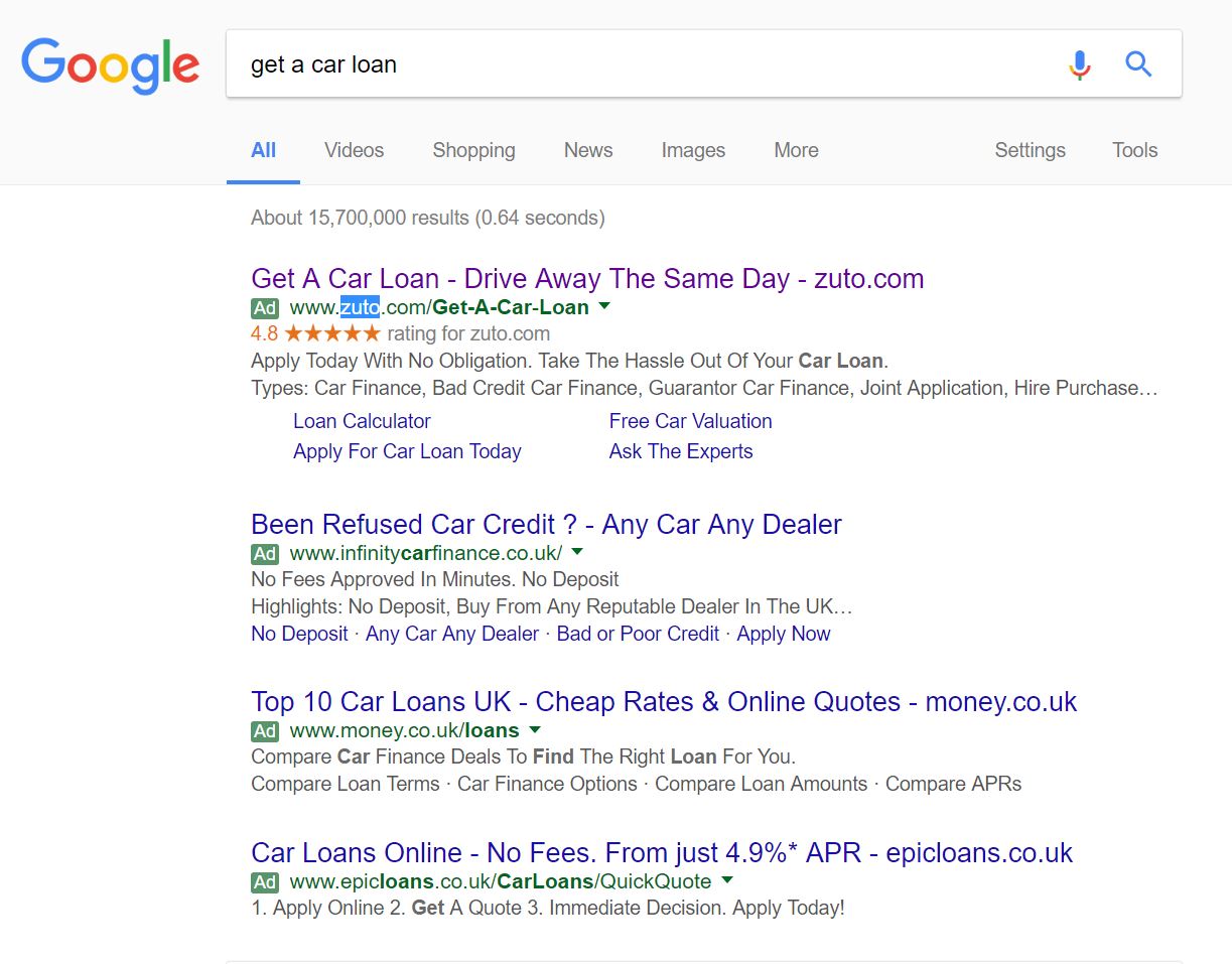 Straight away, it is clear that the level of competition for such a search phrase is extremely high from the maximum of four adverts appearing in the paid search results section. Of this, it is also clear Zuto’s CPC is very high, as they have managed to outbid their competitors to get the top spot for such a crucial search phrase.
Looking at Zuto’s search advert, it is a great example of how site link extensions can help make an advert stand out. This is through increasing the area the advert takes up (achieved through the site link extensions) and adding a touch of colour to differentiate the advert further from the rest (with the ratings extension). This is a good technique to adopt since, at the end of the day, you want to make your advert stand out as much as possible when next to competitor adverts – one way to do this is to use ad extensions competitors do not use. So, even without looking at the content (which adopts the typical ‘address the search phrase’, CTA and then brand name/URL’ for the title), it is a very well made search advert.
After clicking on the above advert, I came to the following landing page: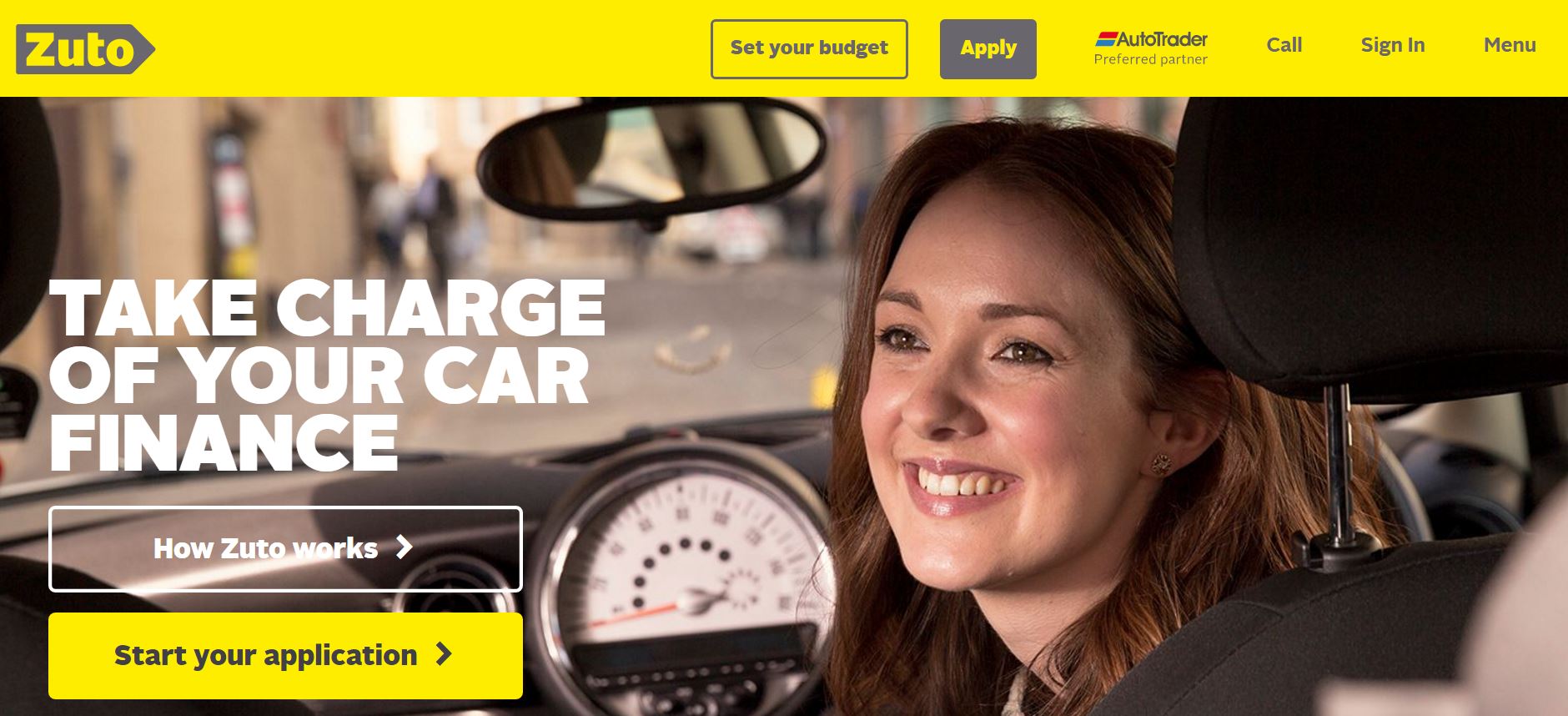 The large ‘Start your application’ button makes clear that this is a click through landing page. For this reason, the main objective of this landing page is to convince web users to click onto the button to continue the converison and take out a car loan.
The problem with this is that there is not any content that will work to entice web users into using Zuto for car loans – the content is below the fold of the page. It would have made more sense to use something such as a rule of three above the fold to give reasons why the web user should go for Zuto and get them to click onto the button.
Putting this aside, an image always works extremely well on landing pages and this is, by no means, an exception. The smiling lady in the car gives the impression that she is happy because she has taken ‘charge of her car finance’ through using Zuto – this encourages others to want to use Zuto to achieve the same emotions/feelings the lady in the image appears to have.
You must be logged in to post a commentLogin