The last PPC campaign I analysed in the ‘Analyse A Real PPC Campaign’ was from Quidco, who had a very good PPC campaign in general that was used to counteract the poor SEO of Quidco. The search advert was good and utilized the use of ad extensions whilst the landing page was clear, simple and colorful: clearly outlining what the conversion should be for the page.
An area of PPC that is likely to have a large level of competition and a high CPC for keywords is in housing extensions, considering a conversion can be worth thousands to a company. Looking into this sector, here is an analysis of a PPC campaign from Everest.
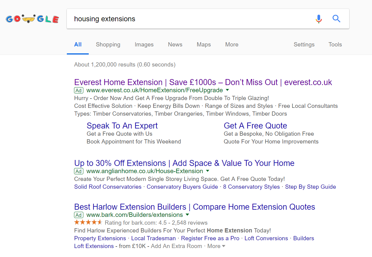
To view Everest’s PPC search advert, I had to type into Google search UK, ‘housing extensions’: Straight away, we can see that Everest would have used a high CPC for this search phrase, considering they rank number one in paid search results. It is a content heavy advert which helps to push the focus away from the competitor adverts below it, increasing the exposure level of Everest’s advert:
- The title is content heavy, including the brand name multiple times, a call to action ‘Don’s Miss Out’ as well as the website URL, to promote direct traffic.
- The description is very effective too:
- The first line is another call to action.
- The second line has snippets of reasons to choose Everest over competitors, whilst the third line provides the web user information as to what type of work Everest can do.
- The ad extension used contributes to the success of this advert. The site link extension displays a further two call to actions, in the form of a link each.
A summary of this advert makes clear that it is content heavy and full completely with call to actions. From doing this, there is more reason for the web user to click onto the advert to fulfill the actions requested by Everest in the advert.
After clicking on the above advert, I came to the following landing page: This landing page appears to be a lead capture landing page, where the conversion is to get the web user into filling in the form to receive a free quote. This is supported by the fact one of the site link extensions used in the search advert mentioned about getting a free quote too.
- The navigation menu at the top expands upon hovering, offering the web user plenty of areas to click onto, with regards to what Everest can offer.
- There is a lack of links on the landing page, albeit the navigation menu at the top. This is so that the conversion, being a lead capture, is not negatively affected from the web user being presented the opportunity to click away from the form to fill in. This tends to be the case for lead capture pages.
- From the form appearing slightly below the fold, it encourages the web user to scroll down, where more reasons to go with Everest are.
Overall, this landing page is a great example of how a lead capture page should be. A beautiful image to attract the web user in, with minimal links (apart from the navigation menu) and a form that is clearly visible but below the fold to encourage the web user to see more reasons to go with Everest.
You must be logged in to post a commentLogin