The last PPC campaign I analysed in the ‘Analyse A Real PPC Campaign’ series was from Three, who had a well designed search advert and a clean looking landing page. Three had also added typo keywords to those that wanted to target, which is an important thing to do for PPC campaigns. Most searches will have some sort of typo in them. If you do not target typos in PPC, you might be missing out on a lot of contextual traffic. On top of this, the CPC of the typo keyword might actually be less than the typo-corrected.
With it coming towards the end of October, it is typical to see a lot of adverts around Halloween. With this, here is an analysis of a PPC campaign from Beauty Bay.
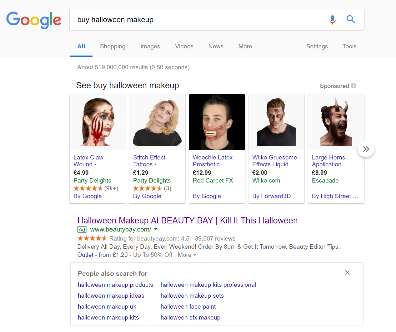
To view Beauty Bay’s search advert, I had to type into Google search UK, ‘buy halloween makeup’: It is surprising only one advert appears for this search phrase. However, this does not mean it is all plane sailing for Beauty Bay – instead of PPC search adverts, they will be competing against Google sponsored shopping results, which have the advantage of showing prices and images per product.
Looking at the advert itself, it is well designed for the following reasons:
- The title straight away addresses what the web user searched for, followed by the brand name. There is a clever pun call to action which will help to evoke a click onto the advert from the web user.
- It is a good idea Beauty Bay chose the ratings extension to include with their advert. Beauty Bay has a high rating by thousands of people, giving the web user confidence to shop with them.
- The description is very much shipping/postage and packaging focus. This is a great idea, especially since Halloween is around a week away: Beauty Bay are stating that there is no problem shopping so close to Halloween online with them: you will get it in time before the actual day of Halloween.
After clicking on the above advert, I came to the following landing page: This landing page is not the best example of a landing page for such an advert. This is an example of product/service page, with the products showing below the fold of the page. However, there is not much of an incentive for the web user to scroll below the fold. Instead, what this landing page suggests is that it is a click through landing page. This is due to the fact that:
- The menu is hidden in the top left, limiting the amount of links the web user can click onto
- The two images in the middle are links to getting ‘the look’ for each picture and makeup
However, the problem with this is that Beauty Bay are limiting their market straight away by doing this. The two images are very intricate, which would not apply to kid’s Halloween makeup. As well as this, the two images are of girls, limiting guys into wanting to have a look that seems to be targeted at girls. From this, Beauty Bay should have shifted the products above the fold, so that the web user can scroll through the products they sell quick and easily, filtering out what they want/don’t want.
You must be logged in to post a commentLogin