The last PPC campaign I analysed in the ‘Analyse A Real PPC Campaign’ series was from Sytner, who had a poor targeted PPC campaign, mainly because they did not include the negative keyword ‘buy’ in their campaign (where they were looking to sell BMWs). As well as this, the landing page was un-inspiring and did not have the necessary elements for a landing page looking to promote selling BMW vehicles through them.
A market that will always look to utilize PPC is the phone market, since most consumers look to renew phone contracts and buy smartphones or a regular basis. With this, here is an analysis of a PPC campaign from Three.
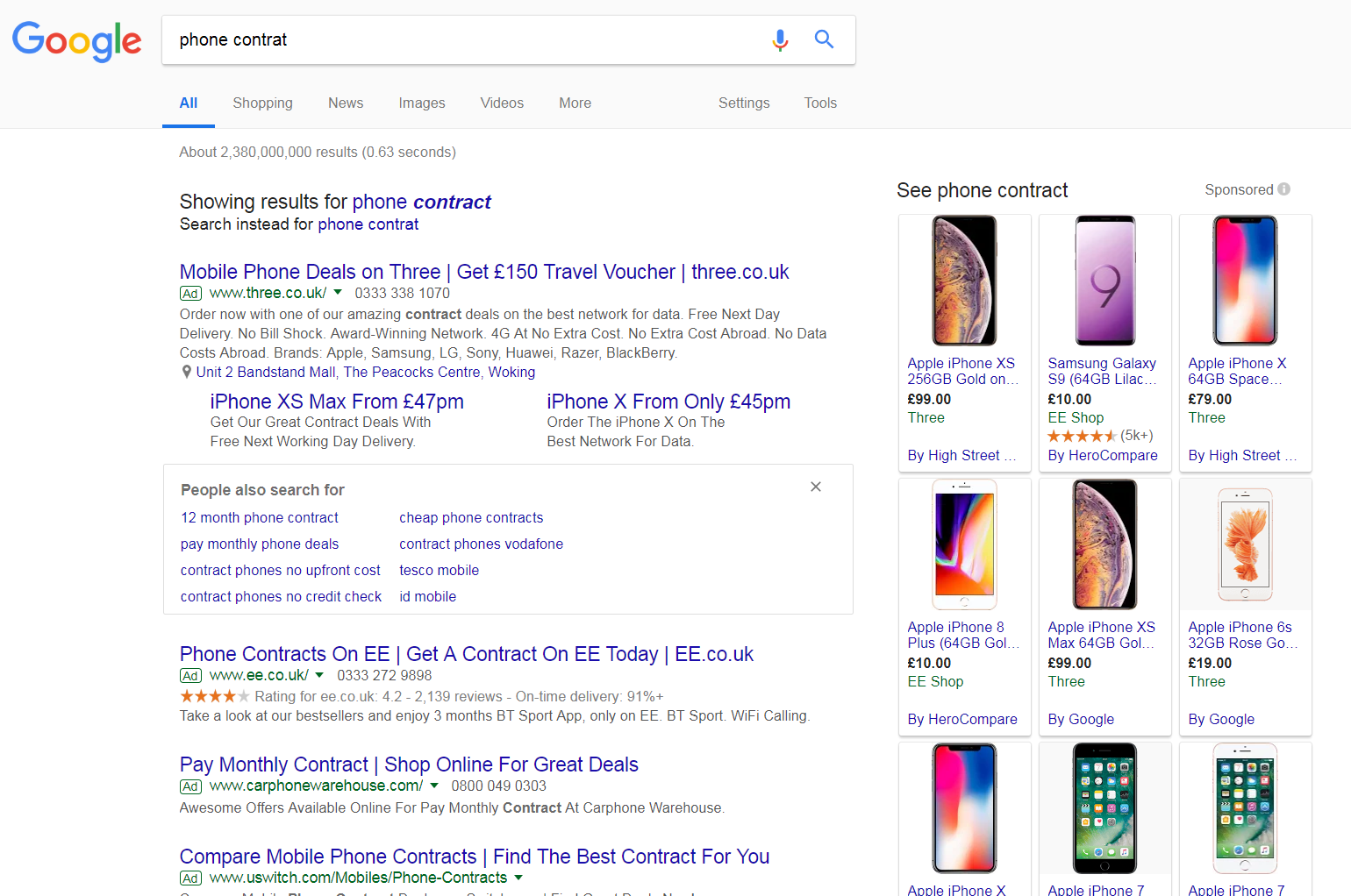
To view Three’s PPC search advert I had to type into Google search UK, ‘phone contrat’: The competition for this search phrase is fierce, and should it should be. Most consumers stick to a network for a relatively long time, so the repeated sales for such a conversion would be quite high. It is good that these companies have made sure they bid for mis-spellings and typos, since a lot of PPC traffic comes from typo Google searches.
Looking at Three’s advert, it is great that they rank first for this search phrase, especially due to the competition. The fact there are Google sponsored results and a ‘People also search for’ snippet highlights the importance of ranking higher in paid search results. If Three ranked 2/3/4, the exposure they would get for their advert would be significantly reduced. They have maximized exposure through their ranking, as well as with the addition of a few ad extensions.
This is an example of a content heavy advert. The idea behind this is to say enough to satisfy the 95% percentile into clicking on the advert. This is partly the reason for Three listing the main manufacturers of smartphones they sell through their store. Due to it being content heavy, it is likely the web user will only read the title, which will inherit a high CTR due to a call to action being in it with ‘Get £150 Travel Voucher’.
After clicking on the above advert, I came to the following landing page: This a very well designed click through landing page for a number of reasons:
- It is clean in how it looks, but holds quite a lot of information on it. This is achieved by having the links in the form of image links. For example, the central image is a link slideshow, with the black and white images at the bottom being links to certain areas of Three’s website.
- The slideshow is a great idea for such a click through landing page, so that it showcases what Three can offer consumers.
- The navigation menu expands upon hovering, allowing the web user to click onto any part of Three’s website from such a menu.
- Three have also been clever here by including a call to action on each slideshow image link. For click through landing pages, the objective is a click. Therefore, it is a good idea to have CTAs on such a landing page. By including qwerky CTAs with each image encourages the web user to click onto each.
You must be logged in to post a commentLogin