The last PPC campaign I analysed in the ‘Analyse A Real PPC Campaign’ was from Admiral, who had both a well designed search advert and landing page, that would have attracted healthy click through rates.
An area that is always fiercely competitive in PPC is with the bank industry – mortgages, loans, bank accounts and credit cards. This is because the profit made from a sign up to a bank/mortgage/credit card etc. is huge, especially if the web user stays a loyal consumer for years on end. With this, here is an analysis of a PPC campaign from Aqua Card.
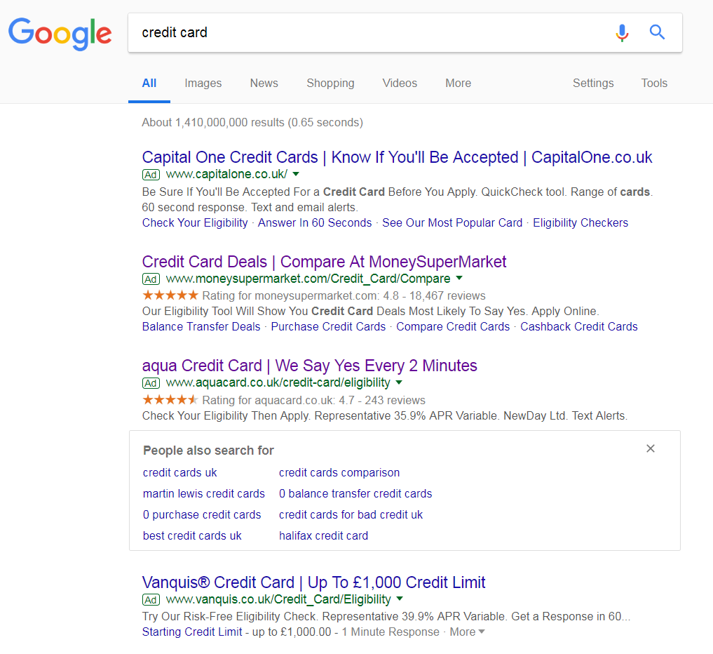
To view Aqua Card’s PPC search advert, I had to type into Google search UK, ‘credit card’: The maximum of four adverts are appearing for this search phrase, which is no surprise at all for such a sector. Aqua Card rank 3rd in paid search results, which is not ideal at all. In general, aiming for the top two spots will give you a good chance of getting lots of clicks. When 3rd and 4th, you will need to do a few extra things to make your advert stand out:
- Content heavy
- Use lots of ad extensions
- Use lots of call to actions
- Use numbers
Although Aqua Card have used the ratings extension, the advert is not doing enough to recover the poor ranking in paid search results. Ideally, using more ad extensions, alongside a content-heavier title, would work well to improving this search advert.
After clicking on the above advert, I came to the following landing page: Where the search advert had areas of improvement, I cannot see many here because this is a really good landing page. Below are the main points as to why this will get the results Aqua Card are looking for:
- The background and theme of the landing page goes with the brand name ‘Aqua’. It is beautifully designed and very easy on the eyes – there is absolutely no reason to click away from this page just from having a first glance.
- This is a click through landing page, where Aqua Card wants to get the web user to click onto a link to move to another page (almost like a ‘middle man’ landing page). This is clear from the bright and contrasting color button ‘CHECK MY ELIGIBILITY’.
- Aqua Card have used the rule of three to the left hand side, providing three bullet points as to why web users should use Aqua Card for a credit card service. This is an effective enticement tool that is used a lot in PPC.
- There are the use of numbers on the landing page, making clear what Aqua Card offers. This is important to include since not many web users will apply for a card if they don’t know the APR and credit limit.
- Due to the fact this is a click through landing page and the button to click onto is above the fold, there is absolutely no reason for wanting the web user to scroll below the fold (and lose sight of the button to click). Aqua Card have realized this, making sure that their landing page does not have any content below the fold at all, so it is not possible to scroll.
You must be logged in to post a commentLogin