The last PPC campaign I analysed in the ‘Analyse A Real PPC Campaign’ series was from Beauty Bay, who had a campaign promoting their Halloween makeup. However, their main problem was that they were limiting their target audience far quicker than they should have, reducing the amount of usable PPC traffic that would actually be interested in converting.
A popular sector, especially in paid search, is in finance and car loans. With this, here is an analysis of a PPC campaign from Admiral.
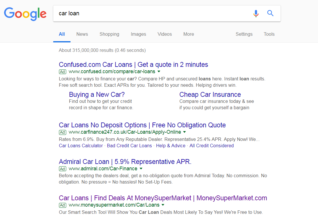
To view Admiral’s PPC search advert, I had to type into Google search UK, ‘car loan’: Although Admiral rank on the first page of search results, they are 10th, which is not the best place to be organically – this provides plentiful reason to create a PPC campaign for this keyword search phrase.
Looking at the search advert itself, it is a well designed search advert for the following reasons:
- Title – the title addresses exactly what the web user searched for. What more, the addition of quantifiable data adds an enticement to the web user. Adding numbers should be used with caution, though, since this provides scope for competition to undercut you. Thankfully for Admiral, they are the lowest APR available of the adverts that share such a number.
- Description – The description includes a call to action. What is great, as well, is the fact the description uses the rule of three to further entice the web user into clicking.
- URL – The URL is contextual and keyword heavy. However, the actual URL they show goes to a 404 error. Remember it is important for web users to visit the landing page from the URL you use in your advert – make sure a redirect is in.
After clicking on the above advert, I came to the following landing page: It is clear that this is a click through landing page from the large green ‘GET A QUOTE’ button. With this in mind, this is a very good landing page:
- The central area of the page is dictated by the button, with a little content to compliment the button. It helps to have bright bold colors such as blue and green, which contrast to each other.
- There is some text that appears to fall below the fold of the landing page. Typically, this would be a problem for a click through landing page, since pushing people below the fold means the button will scroll off screen – how can the web user click onto the button you want them to if they have scrolled past it? What Admiral have done to get round this, with this landing page, is have a floating button that appears at the bottom of the web browser regardless of where the web user has scrolled to. This is really clever, since it allows Admiral to include more information below the fold to entice the web user into clicking on the ‘always there’ button.
You must be logged in to post a commentLogin