The last PPC campaign I analysed in the ‘Analyse A Real PPC Campaign’ series was from Marks and Spencer, who had a well optimized search advert, although not ranked first. The landing page had both good and bad points to it, making clear that it could have been improved.
One market that is booming, and looks to continually boom, is the video streaming service sector – you only have to look at the share price of Netflix rocketing to see this. With this, here is an analysis of a PPC campaign from a competitor to Netflix: Now TV.
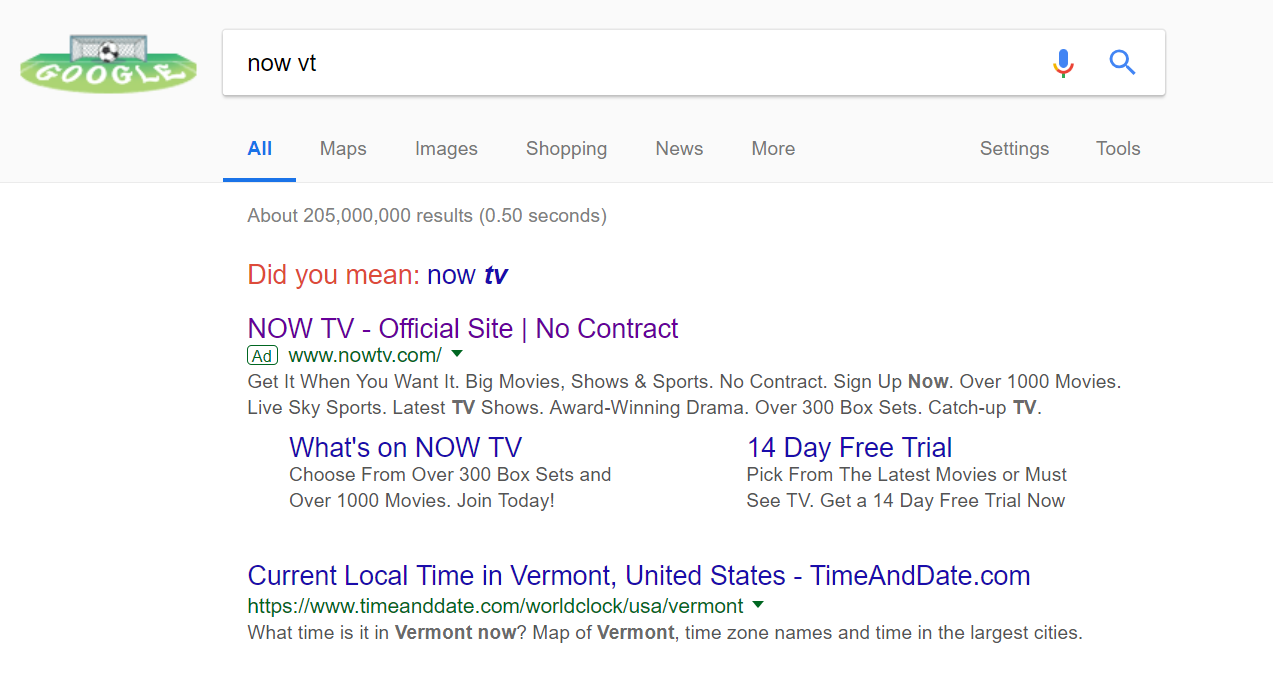
To view Now TV’s PPC search advert, I had to type into Google search UK, ‘now vt’:
Looking at the advert itself, it is very effective. The use of site link extensions helps to advertise the features of Now TV, especially the 14 day free trial, whilst the description is crammed full with the benefits to Now TV. The title is kept short on purpose to home in on the brand name.
After clicking on the above advert, I came to the following landing page:
- Colour always works well on a landing page. Now TV have opted for bright bold colours to make clear of the different options they have with their video streaming service. This also helps to keep the landing page very clean in its look.
- The right area of the landing page is taken up with a slideshow of images of the type of content the web user could watch if they had a Now TV subscription. This is a great idea, since it provides web users an exciting sneak peak into what they could gain.
- Being a click through landing page, this landing page needs links to click onto. The buttons to the left are just that, and are made bright and bold, with a call to action ‘Go’ at the end for each of the subscription options.
This is a brilliant way to contextualize each of the subscription options. From the web user choosing what subscription they want, they are taken to a dedicated landing page promoting just the streaming package the web user wanted. This will, no doubt, help to increase the conversion rate for each of the four packages.


