The last article in the series of ‘Analyse A Real PPC Campaign’ looked at Gillette, who had a well designed search advert and a landing page with both positives and negatives. In this article, with the late introduction of the Apple Watch to the smart watch market, I thought it is only fair to have a look at how Google have coped and reacted through their own online advertising scheme. Here is an analysis of Android Wear’s PPC campaign.
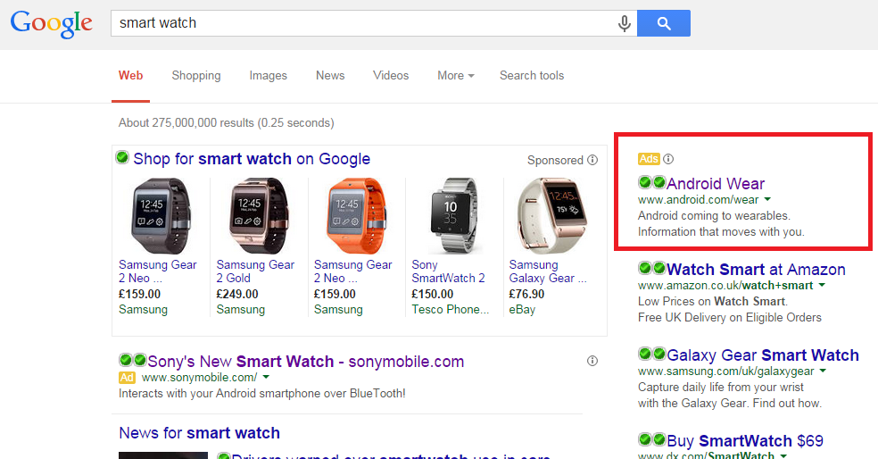
To view Android Wear’s PPC search advert, I had to type into Google search UK, ‘smart watch’: This is the first analysis of a campaign with an advert in the right hand column as I usually look at the area where Sony’s advert is. The right hand column will still get clicks from web users but the CTR will much less than that of where Sony’s advert is and the sponsored shopping results are. It is a fair assumption that the CPC for the right hand column is also much less too which would make it a good addition to a long term strategic campaign.
The advert itself is very simple and that is exactly how it needs to be when placed in the right hand advertising column. There is no space for ad extensions so short and sweet is the way to go.
Although there is no call to action present in the description, the last sentence in the description really entices the web user to click onto the advert. ‘Information that moves with you’. The vagueness of this sentence makes the web user want to find out more about this new concept of Android Wear.
After clicking on the above advert, I came to the following landing page: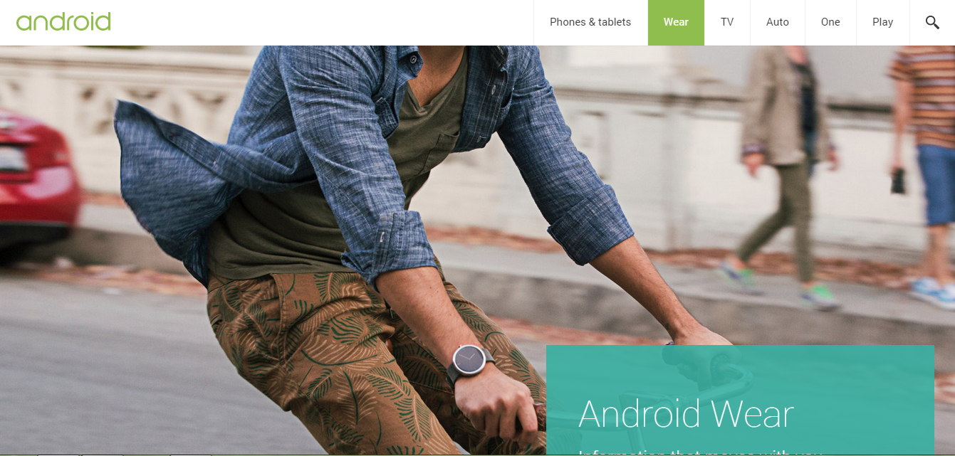 Straight away, we know this is going to be an amazing landing page for the simple fact that its Google. It is interesting that this is the homepage of Android Wear too from looking at the URL for this page being simply ‘android.com/wear/’. This makes clear that if you are trying to promote a product or service, the homepage for that product or service should be able to be a landing page for an advertising campaign since the homepage will have the objective of promoting the product/service as well as enticing the web user into purchasing it.
Here are a few elements to this landing page which makes it amazing:
- The main attraction is a large picture of a man wearing one of the Android Wear products (Moto 360). Although I have said in the past that you should use images to display information in an easy-to-read form, you can also use images to simply lure the web user further in. Google does not want the web user to just see this picture and then exit – they want them to do an action to see more: in this case, scroll down.
- Google have been clever that they have made some of the words go below the fold so that for the web user to continuing reading the limited text above the fold, they must scroll down where there are more large pictures and more information about Android Wear.
- The menu navigation bar at the top is well designed and minimalist to go with the whole theme of the landing page.
You must be logged in to post a commentLogin