Last article in the ‘Analyse A Real PPC Campaign’ series looked at the fashion clothes designer Ralph Lauren, who had a well designed search advert that led traffic to their homepage with a lead capture box popping up first. What was interesting was the reasons behind Ralph Lauren bidding for their own brand name (which you can find out by reading the article). To stop myself analysing another company from bidding against its own brand name, I choose to use a searches phrase which would stimulate competition. For this article, I will be looking at razor blades
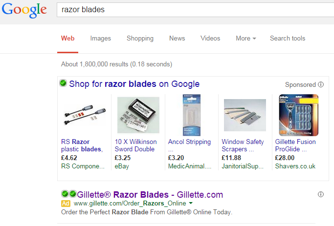
To view adverts based on razor blades , I had to type into Google search UK, ‘razor blades’: Just like with Fitbug, it appears Gillette are the only ones that have made a typical search advert for such a crucial search phrase with the rest being adverts from Google Shopping. Nevertheless, this doesn’t mean Gillette’s advert is going to be bad. In actual fact, it is a good advert for the following reasons:
- They have included the brand name ‘Gillette’ 4 times in the whole advert which is quite high for a brand name density in PPC. This reinforces the brand name to the web user.
- They decided to include the URL in the title so that if web users chose not to click on this advert, they can still reach Gillette’s homepage from knowing what it was from the title of this advert.
- The whole description is a call to action. This encourages the web user to perform an action: in this case, click onto the advert and order a razor from Gillette.
The advert is short and sweet which works to its advantage. For example, if Gillette chose to include some ad extensions, I think it would have cluttered the advert a bit and reduce the CTR of it.
After clicking on the above advert, I came to the following landing page: Straight away, it is clear that this is a product/service page because it is displaying the products Gillette are selling. In essence, this is a well designed landing page for the following reasons:
- The main centre area of the landing page is taking up with an image advertising one of the razor blades of Gillette. The main area of a landing page should try to be as much an image as possible since it is the first place web users will look and lots of content in this area will turn web users away.
- The colour scheme is well thought out, with different complimenting shades of blue through the page.
- There is a navigation menu at the top so if the web user wanted to they can explore the rest of the website.
The only negative thing I can say about the landing page is that there is nothing above the fold that will entice the web user to scroll down to see the rest of the landing page. Usually on a landing page, if the advertiser wanted the web user to scroll, they would cleverly place an image half above the fold, so that the web user has to scroll to see the rest of the image. With Gillette, there is no such thing: the least they could do is have an arrow in the bottom right corner pointing downwards.
You must be logged in to post a commentLogin