The last PPC campaign I analysed in the ‘Analyse A Real PPC Campaign’ was from Truly Experiences, who had a very well designed PPC campaign, with both many positives to the search advert and landing page that were used. At the time of writing this article, it is Christmas Eve which is a very interesting time to analyse a PPC campaign. Postage delays mean that it is no longer feasible to purchase something today in time for Christmas, unless it has same day delivery (for which only Amazon seems to do for limited small items). Here is an analysis of a PPC campaign from Virgin Experience.
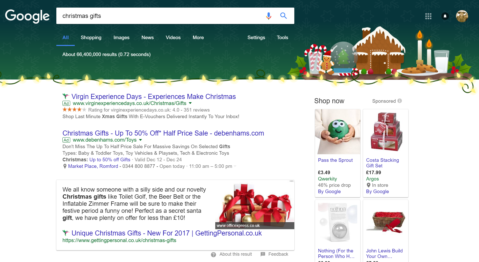
To view Virgin Experience’s PPC search advert, I had to type into Google search UK, ‘christmas gifts’: The most noticeable part to this page is the Google theming for Christmas Eve. This should work to Virgin Experience’s favor, considering the theming goes well with the top paid result. Therefore, it was beneficial for Virgin Experience to have adopted a high CPC for such a search phrase to get top spot.
As already mentioned at the start of the article, there is no time for items to be dispatched in time for Christmas. Due to this, many advertisers finish their holiday PPC campaigns a few days before Christmas – this is illustrated from the lack of PPC adverts appearing, with only 2/4 slots taken. The Google shopping results are still quite competitive, simply because stores want to make clear that you can buy last minute Christmas gifts in their stores, such as Argos.
Looking at the advert itself, it is quite clever due to the type of web user Virgin Experience are targeting. They know that the web user will be in a bit of a panic to buy a gift. Therefore, keeping the search advert short and sweet, in this situation, will prove better since less time is wasted from the perspective of the web user. The title describes what Virgin Experiences offer where the description makes clear the ‘gift’ is sent as an e-gift: in-time for Christmas. Couple this with a ratings ad extension, and Virgin Experiences are onto a winner.
After clicking on the above advert, I came to the following landing page: Of course the landing page would be red dominated since this is the logo colour for Virgin. But, what Virgin Experiences have done here is extend the red theming to cover both their logo as well as a subtle Christmas theming.
This is an example of a click through landing page, and a very effective one at that too. There are lots of links for the web user to explore and shop around to find the right experience to gift someone. Considering the fact that options for gifts are limited due to postage limitations, the web user is not likely to exit this page but explore the e-gifts available and potentially convert for Virgin Experiences. On the whole, this is a very good PPC campaign.


You must be logged in to post a commentLogin