The last PPC campaign analysed in the ‘Analyse A Real PPC Campaign’ series was by We Buy Any Bike, who had a poorly targeted PPC campaign due to the fact the web user (being myself) was wanting to buy a bike and not sell one (as We Buy Any Bike seemed to think). With the Super Bowl 50 being on the night of writing this article, I thought I would look at what adverts in the betting industry will appear on the biggest sports night of the year. Therefore, without further ado, here is a PPC campaign analysis of Titanbet.
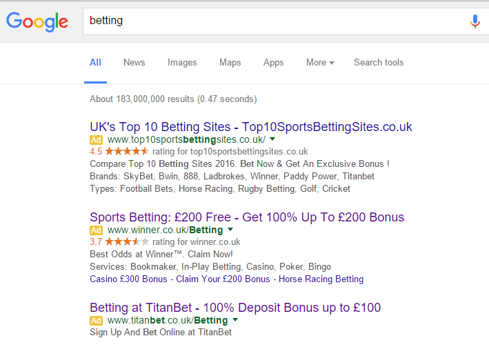
To view Titanbet’s PPC search advert, I had to type into Google search UK, ‘betting’: We can gather some information about Titanbet’s PPC campaign:
- The CPC is lower than the competition – hence why Titanbet are at the bottom of paid search results. There might be a reason for Titanbet adopting a low CPC (such as to get closer to the top of organic search results). However, the likelihood is because the competition has increased the CPC to something Titanbet cannot match.
- Titanbet have used a long title with a bonus to attract price sensitive customers. This is a good idea as most people that bet are looking for deals, free bets and so on…
- The description is short but a call to action. It is good Titanbet chose to include at least one call to action in the PPC search advert. However, the description is too short for my liking – it would have been better if they had some sort of ad extension. The fact there is no ad extension in this advert makes the contents of the advert seem a bit bland.
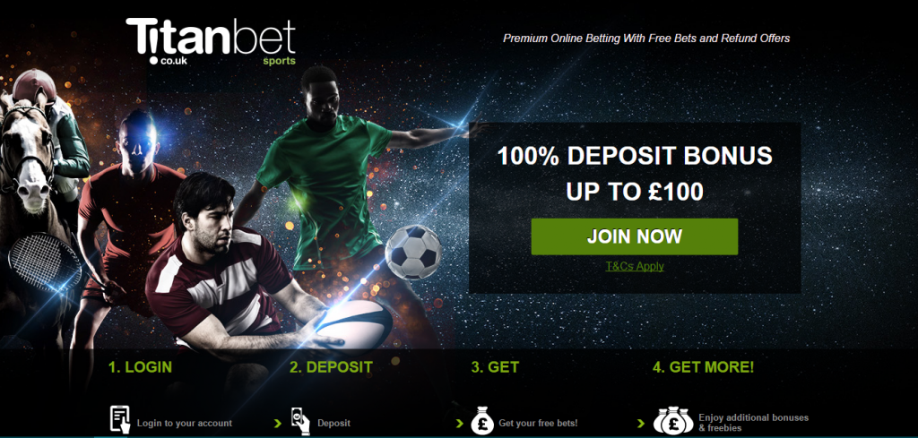
After clicking on the above advert, I came to the following landing page:
- This is a great example of a click through landing page because the button Titanbet wants the web user to click is clear and obvious (being the green ‘Join Now’ button).
- The logo, brand and domain name of Titanbet is all made clear in the top left section of the landing page.
- The center piece, being the image, makes this advert vibrant and pleasing to look at. By including many different sports in the image with the players sparking and glistening makes Titanbet seem a one stop shop for betting on any sport – something they might be wanting to achieve.
- The bonus is reiterated on the landing page above the click through button in bright white capitals to emphasis it to price sensitive customers (which there will be a lot of landing onto this landing page).
- Nothing suggests we have to scroll below the fold of this page. This is because we do not have to. The bottom of the page has step by step instructions for web users to understand how easy it is for them toget the bonus money.
All in all, a brilliant example of a click through landing page.


