The last PPC campaign I analysed in the ‘Analyse A Real PPC Campaign’ series was from Air Tasker, who had a strong search advert, but faltered a little with the landing page that had many areas of improvements.
An area that is always very competitive in January is with getting fit and gyms – it is the time of the year for gyms to make the most of promotion to get those looking to get fit for the new year. With this, here is an analysis of a PPC campaign from The Gym Group.
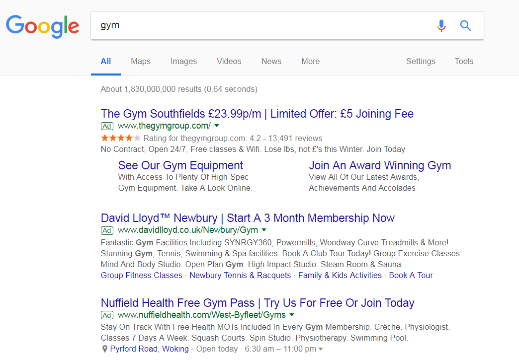
To view The Gym Group’s PPC search advert, I had to type into Google search UK, ‘gym’: Only three adverts appear for this search phrase which is a little surprising. A reason for this could be down to the search phrase I had used – for many gyms, bidding for ‘gym’ is far too vague and expensive to warrant using it for keyword targeting. This is solidified by searching ‘gym membership deals’ and ‘gym sign up near me’, which have the maximum of four adverts appearing.
Looking at the advert itself, the advert has a good use of ad extensions to set it apart from the competition. The ratings extension makes clear that the Gym is highly regarded by customers, whilst the site links extension cleverly uses a call to action per link to entice the web user into a click – this would significantly help the CTR of the advert on the whole.
The Gym Group have also been clever, by providing pricing on paid search results; something the other adverts do not do. This sets them apart, since it makes the other adverts immediately seem more expensive, if they are unwilling to show prices and be transparent like The Gym Group are.
After clicking on the above advert, I came to the following landing page: As a landing page goes, this is effective for the following reasons:
- This is an example of a click through landing page. This is clear from the ‘Join Now’ button in the bottom right.
- The main reason for this type of landing page is to convince web users to a conversion, where the search advert was not enough.
- The landing page is full of images of people in the gym, along with reasons to sign up, helping to entice web users into converting.
- The central area is taken up with a video slideshow, showing the range of equipment and different people that are using The Gym Group – this will encourage web users to sign up, since anyone can use the gym with The Gym Group.
- The navigation menu is minimalist, pushing more attention to the video slideshow and other areas of the landing page that are more important.
- A range of bright colors have been used on the page, to grab the web user’s focus – something that is common in gyms too.
The only problem with this click through landing page is the fact the ‘Join Now’ button is not that noticeable – considering this is what The Gym Group wants the web user to do (click ‘Join Now’),


You must be logged in to post a commentLogin