The last PPC Campaign I analysed in the ‘Analyse A Real PPC Campaign’ series was from Car Money, who had a few areas they could have improved their search advert, especially from the fierce competition and the lack of ranking top spot of paid search results. However, they recovered with a well optimized landing page that would have resulted in a lot of lead captures.
An area that is very popular on the internet (of course) is with hiring freelancers and being hired as a freelancer (since most websites will use freelancers at some point or another). With this, here is an analysis of a PPC campaign from Air Tasker.
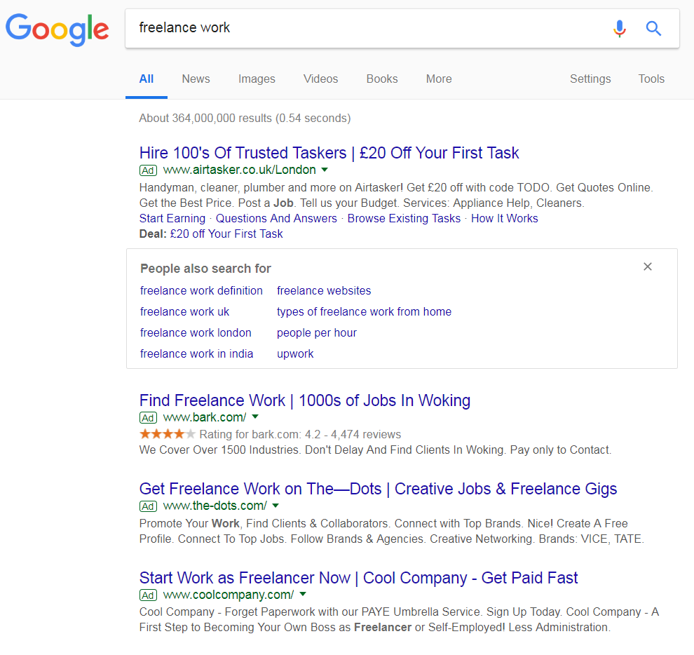
To view Air Tasker’s PPC search advert, I had to type into Google search UK, ‘freelance work’:
Competition is strong with the maximum of four adverts showing for paid search results. On top of this, the ‘People also searched for’ box has appeared below the top result, making it more crucial for Air Tasker to get #1 spot (such a box actually pushed the 4th position below the fold of the results page).
Straight away, it appears that there might be a miss-direction with regards to the targeting of the PPC campaign. The search phrase used was to look specifically for freelancers, which is an online work role. The fact that the description includes traditional trades, such as plumbers and handymen, will put off people from clicking onto the advert, since this is very different from freelance website work. For this reason, it is highly recommended that Air Tasker increase the specific keywords they want to target, as well as include negative keywords.
After clicking on the above advert, I came to the following landing page:
- For a click through landing page the button should be big, bright and bold (the three Bs). It’s bright, but not big or bold. In actual fact, it is dwarfed in size by the text above it. If Air Tasker made the button as big as the biggest font on the landing page, I have no doubt the CTR would increase.
- The actual image used is a bit bland with the color scheme, as well as a little confusing. It isn’t obviously what the trade is, or what the man is doing or so happy about. Grey is a very bad color to use as a background to a landing page in general.
- It would have been better as a landing page to have a lead capture, such as a search bar to allow web users to search for the specific trade they are looking for, instead of a CTR to the lead capture page (this click through page is a bit redundant as it does not provide additional reasons to use Air Tasker, which is what the page should do as a click through page).


