The last PPC campaign I analysed in the ‘Analyse A Real PPC Campaign’ series was from Adidas, who had ideally created a PPC campaign in order to attract web users to buying direct from themselves, rather than Manchester United (where direct would enable the profit margin of Adidas to be as large as possible). However, though, the landing page had a few areas of improvements that could have made it more effective.
Something that I think all of us have will be some sort of video streaming service. One series that Amazon Prime Video likes to publicize a lot, as a way to get new customers in and existing customers to stay, is The Grand Tour series. Looking at this, here is an analysis of an Amazon Prime Video PPC campaign, looking at specifically the Grand Tour.
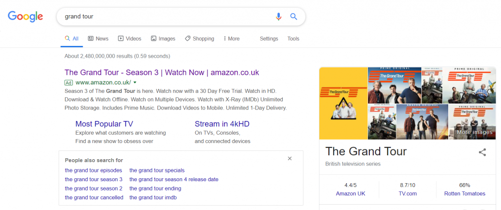
To view The Grand Tour’s PPC search advert, I had to type into Google search UK, ‘grand tiyr’: This is an example of a PPC campaign that has purposely targeted typos and misspellings as keywords to bid against. The benefit of doing this is that the CPC (cost per click) that typo keyword search phrases achieve is a fraction of the cost, but so is the traffic too. Irrespective of this, it is a great idea to include common typos of your search phrase to gain as much traffic as possible, at the cheapest price too.
The search advert itself is well optimized for the target market: web users wanting to watch The Grand Tour:
- The title addresses the search phrase, whilst including a call to action (which coincidentally is the conversion Amazon Prime Video wants to achieve).
- The site links extension is an interesting choice of links. The ‘Most Popular TV Shows’ is there to broaden the knowledge to the web user of what Amazon Prime Video can offer, whilst the mention of 4K might help to encourage web users to explore the quality of stream.
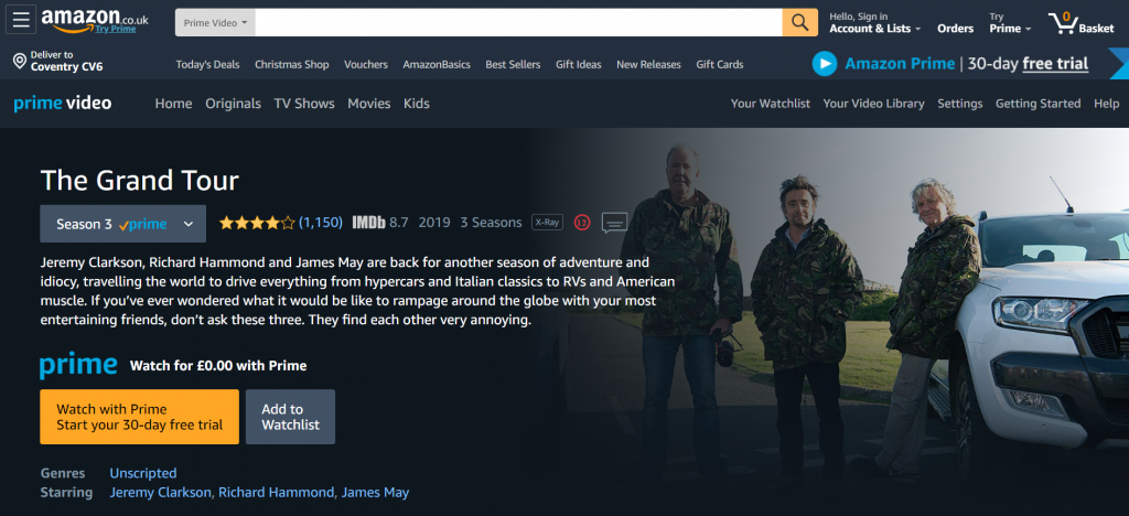
After clicking on the above advert, I came to the following landing page: As a landing page goes, this is an example of a click through landing page and a very effective one of that too:
- Amazon’s navigation menu and general theme is, pretty much, known by everyone. For this reason, it is very useful that the web user has access to the whole suite of Amazon if they should not wish to watch The Grand Tour – at the end of the day, as long as the web user stays on Amazon, Amazon should be happy.
- The Grand Tour show is described in detail, with a background image of the three presenters of the show – this is the best way to entice the web user in without actually showing the footage of the show.
- The click through button for the landing page is purposefully a different colour (orange) to help it stand out – the use of a free trial will also be good at enticing web users into signing up to Amazon Prime Video after clicking on the button.


