The last PPC campaign I analysed in the ‘Analyse A Real PPC Campaign’ series was from Pockit, who had, on the whole, a very good landing page where both the search advert and landing page had many positives associated to each for which many PPC advertisers can take note of. With technology constantly increasingly, there is a constant market to upgrade, improve and buy new laptops and computers to keep up to date with the daily needs of businesses and personal users. One of the many upgrades that many are looking into is with upgrading mechanical hard drives to solid state drives for improved performance of their computers and laptops. Looking at this sector, here is an analysis of a PPC campaign from Tegile.
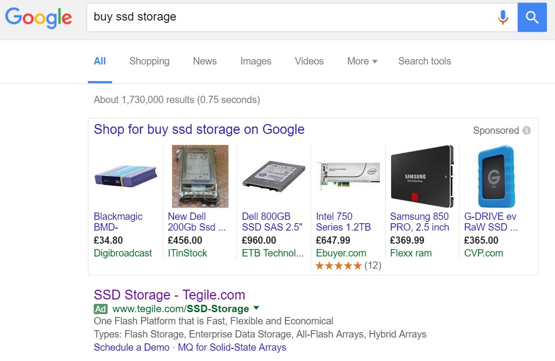
To view Tegile’s PPC search advert, I had to type into Google search UK, ‘buy ssd storage’: Straight away, the most noticeable thing is the fact Tegile is the only structured PPC search advert with sponsored Google shopping results above it. This can work both for and against Tegile:
- It makes Tegile’s advert look more organic that it is the only associated PPC search advert for this keyword search phrase.
- However, the shopping results above will take traffic away from Tegile from displaying prices associated to the SSD storage for sale.
Looking at the advert itself, it adopts, what is seemingly becoming, the standard title layout of addressing the keyword search phrase first followed by the URL of Tegile. However, after that, the advert goes a bit downhill. The description goes into a little too much detail and does not include any sort of call to action, which is always extremely easy to implement and can seriously improve the CTR of a search advert. As well as this, the site link extension is not used to the ad extension’s full potential, only showing two links for which do not seem to be the most clickable of links. So overall, this advert has a few areas it can definitely improve.
After clicking on the above advert, I came to the following landing page: Usually in this series, the landing pages are very well optimised. I am really glad I have come across this landing page as it is a great example of how to not do a landing page. Here are the main negative points associated to this landing page:
- There is far too much content – Regardless of what type of landing page Tegile was going for (in this case, the form on the right hand side suggests a lead capture page), it has too much content above the fold of the page. This should have at least been spread above and further below the fold of the landing page.
- There is no mention on any part of the landing page what Tegile wants the web user to do (such as what their conversion is). Well, there is. But, it is deep into the paragraphs of the content making it hard to pin point. So, on first impressions, we have no clue what the form filling is for!
- The targeting of this landing page is awful. I simply wanted to buy solid state storage for, let’s say a laptop and now filling in a form to download something else – for the majority of web users who landed onto this page like me, they will probably click away from it straight away!


