The last PPC campaign I analysed in the ‘Analyse A Real PPC Campaign’ series was from uSwitch, who had produced a pretty good campaign in general where both the search advert and landing page looked well optimized. My only niggle was with the landing page where the central right area was taken up with advertisement, which seemed a bit wrong on a comparison website – paying to get advertisers onto a landing page where others have paid to advertise their products unfairly, above the fold, before others. With the football (soccer) Premier League coming to an end in the next month or so and the possibilities of Leicester City winning it from only being promoted to the league last season, I thought it would be a prime time to look at a campaign looking to sell web users Premier League tickets. Therefore, without further ado, here is an analysis of StubHub!’s PPC campaign.
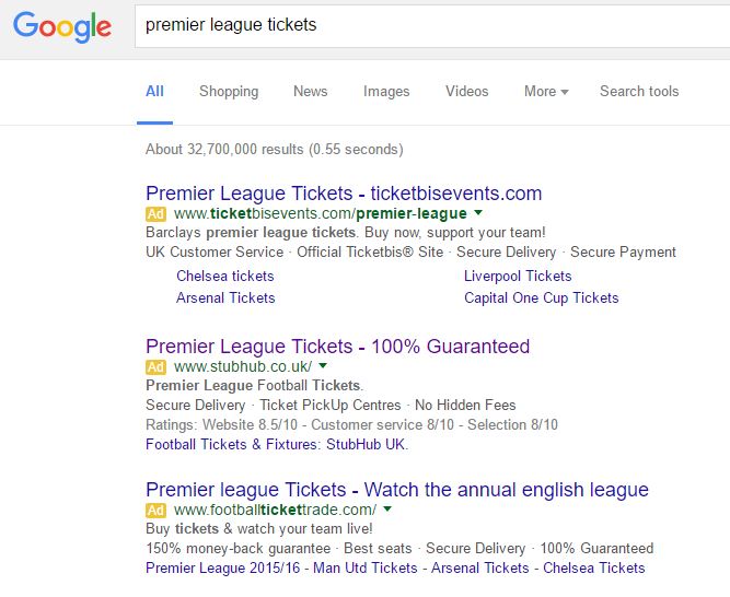
To view StubHub!’s search advert, I had to type into Google search UK, ‘premier league tickets’:
My only negative point to this advert is the site link extension – why have StubHub! chosen to only have one site link extension and why have they used the one that they have used? It would have been far more effective is they had two or three site link extensions such as ‘Football Fixtures / Ticket Promotions / Tickets for next weekend’ etc.
After clicking on the above advert, I came to the following landing page:
- At the time of clicking onto this landing page, it was 7:51pm on Saturday 9th April. Therefore, why on earth are they showing me tickets from 3pm? A waste of space which would induce a lot of exits.
- The main space of the landing page is wasted displaying ‘2015 Premier League Tickets’ – we are in 2016 now StubHub!…again, this terrible typo will cause a lot of people to click off the landing page.
- If they wanted to make the landing page better quickly, they should have landed the web user onto the same page but have the ‘Categories’ tab open. This displays all of the teams in the Premier League which will help the web user find the tickets they want much faster.


