The last PPC campaign I analysed in the ‘Analyse A Real PPC Campaign’ series was from Nesta, who had a generally good search advert but a truly poor landing page: possibly one of the worst landing pages I have seen in the whole of this series since it begun. With comparison websites booming in popularity to help web users compare banks, insurances and more, I thought this would be the perfect opportunity to analyse one the companies in this sector. Therefore, without further ado, here is an analysis of uSwitch’s PPC campaign.
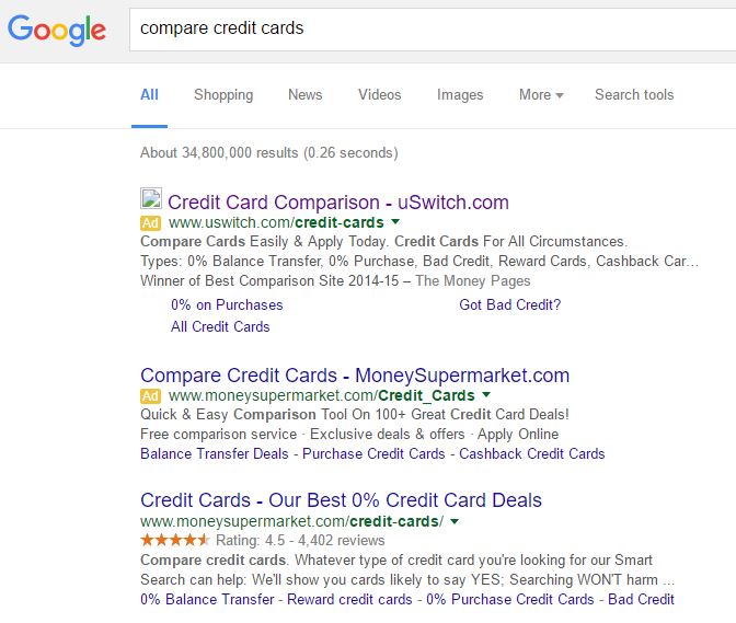
To view uSwitch’s PPC search advert, I had to type into Google search UK, ‘compare credit cards’: Although unrelated, it is interesting that MoneySuperMarket have a PPC advert for such a keyword search phrase even though they are ranked #1 organically – I would have thought that if they were going to bid for such a keyword search phrase, they would have at least outbid uSwitch for number one sport on paid search results.
uSwitch’s PPC search advert is a great example of how an advert should be done:
- The title addresses exactly what I searched for. This will be effective in getting my attention to either click onto the advert or read the rest of the advert. uSwitch added their domain name in the title too to help with gaining more direct traffic.
- The description is packed with information which all works to show off the capabilities uSwitch are offering the web user – no matter what I wanted to know about credit cards, uSwitch are telling me they have something useful to my needs.
- The site link extensions help to take up some real estate space. However, to what extent they are actually useful is another question. At the minimum, it gives the web user three extra links to click onto if they want, helping to increase the CTR of the overall advert.
After clicking on the above advert, I came to the following landing page: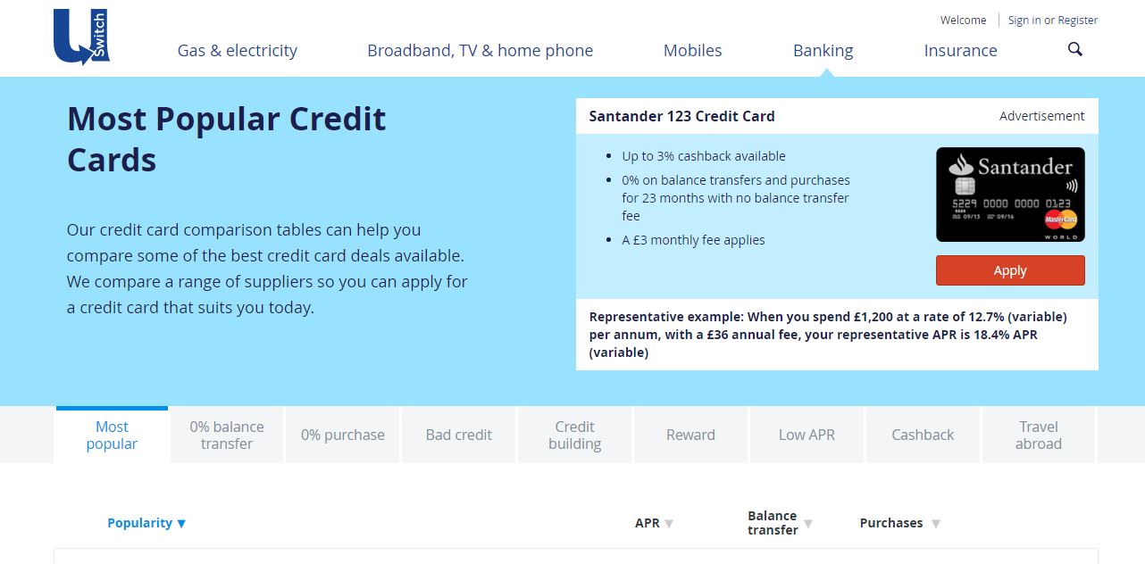 This landing page by uSwitch has many good points to it outlined below:
- The colour scheme is the first thing that stands out to me. It is cool and easy to look out which will definitely help out with reducing the bounce and exit rate.
- The navigation menu looks clean and has drop downs upon hovering, helping the web user to find exactly what they are looking for or browse the rest of the website.
- The comparison of credit cards is below the fold, made quite clearly by the bottom third/quarter of the page. This layout is very clear and easy to read, making it an enjoyable experience to browse through the credit cards.
My only annoyance of this landing page is the Santander credit card shown above the fold to the right. Yes, it relates to what I searched for. But, on closer expectation, we see it is an advertisement. This means uSwitch have paid to get me to go onto a website where they are paid to show a credit card, giving Santander an advantage over the rest of the credit cards compared below the fold. As things go, this is quite cheeky – it would have been much better if that area was showing the best overall credit card for people instead.
You must be logged in to post a commentLogin