The last PPC campaign I analysed in the ‘Analyse A Real PPC Campaign’ series was from Computer Planet, who had a good search advert and a very ‘busy’ landing page with lots of links, images and content. However, from understanding the traffic that Computer Planet was targeting, it made sense for the landing page to be designed in this way.
With music streaming being at its most popular now, it would be interesting to see a PPC campaign from one of the market leaders. Here is an analysis of a PPC campaign from Spotify.
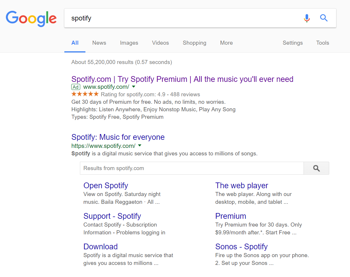
To view Spotify’s PPC search advert, I had to type into Google search UK, ‘spotify’: In this case, Spotify have decided to target their own brand name. This is usually to ward off competition, because they do not rank organically #1 or to bring something else to the organic search engine results for which the organic links of Spotify lack. In this instance, Spotify’s top organic result goes to Spotify’s homepage, which has a free option for music as well as a Premium version (without adverts). The advert is targeted at attracting web users to just Premium, since Spotify’s business model consists of profiting from the subscription fee of their Premium service mainly. This is a good idea by Spotify, since having more people see their paid service rather than free will, no doubt, cause the paid subscription count to increase for them.
The search advert is also well designed, with the brand name, call to action and an enticement in the title, a ratings extension to show people love Premium with a description that goes into more detail about why you should purchase Premium and the benefits of it.
After clicking on the above advert, I came to the following landing page: I really like this landing page for its simplicity which outlines exactly what Spotify wants to portray Premium as – nothing gets in the way of listening to whatever music you want with Premium. This is a great landing page because:
- The background is image is simple, colorful and elucidates enjoyment for Premium. The ‘celebration’ style to it makes the web user feel like celebrating when or if they choose to go for Premium.
- The navigation menu is very simple at the top, to make sure the attention of the web user is attracted to the button in the central area of the landing page.
- The largest text on this landing page also consists in the middle of the landing page, making crystal clear what Spotify wants the web user to read first on the page.
- The button is green in color, which has a ‘healthy’ association to it. On top of this, the fact there is the option of a free-trial provides little reason for why the web user should not try out Spotify.
- Below the fold is simple large font, with simple images, as to why the web user should join Spotify, if they were not convinced.
I am really impressed with this PPC campaign on the whole – sometimes, complexity does not get conversions but, on the flip side, simplicity. Spotify’s PPC campaign is a great example of this.


