The last campaign to have been analysed in the ‘Analyse A Real PPC Campaign’ series was Tesco Bank, who did have a few areas, I felt, they could have improved on such as the general use of space on their landing page. In this article, I thought it would be useful to analyse a campaign from quite a competitive market: purchasing online films. For this reason, without further ado, the campaign I chose to analyse was Sky Store.
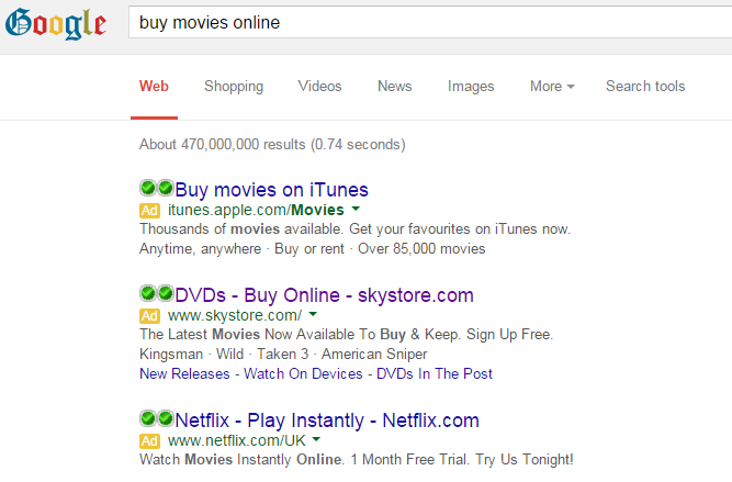
To view Sky Store’s PPC search advert, I had to type into Google search UK, ‘buy movies online’: Without having an organic result for Sky Store on the first page of results, there is plenty of incentive to why Sky Store paid to get closer to top spot for such a crucial search phrase.
Looking at the advert itself, it is generally good. There are good and points to it, though:
- The title gives the impression that the Sky Store is all about buying DVDs. This is false as Sky Store allows consumers to watch movies on their electronic devices too (as made apparent from the site links extension). The title should give an overview of the advert’s content and not just look into one specific area like Sky Store have done. This will affect the performance of this advert since many web users may want to buy and stream movies and not buy DVDs.
- There are two call to actions in the advert, which is the upper limit of what should be used – I am pleased they have included this in the advert at least as CTAs help to improve the CTR of an advert.
- By including film titles in the description portrays the Sky Store of having access to the most up to date films, unlike what the other two adverts have done. Sky Store have an up to date advert which is optimised for the time it is displayed to web users.
After clicking on the above advert, I came to the following landing page: I really this landing page for the following reasons:
- The navigation menu appears from the left inwards by clicking on the ‘Browse’ button in the top left. Not only is this slick, it saves a lot of space so that more space can be used for a minimalistic theme and for the slideshow area.
- The main centre area is taken up by a slideshow of the up to date films Sky Store have on offer to purchase or rent. This is great as it shows the selection of films Sky Store have on offer.
- The two boxes at the bottom make clear what their conversion is. They want people to learn about the Sky Store and to sign up to start using their service.
The only point I do not like about this landing page is the fact that there is quite a lot of content below the fold of the landing page. It seems that most advertisers do not feel the need to include something such as a small arrow to suggest there is content below the fold of the landing page. However, I feel it is a necessity that can only improve the performance of a, and this, landing page.


