
The last PPC campaign I analysed in the ‘Analyse A Real PPC Campaign’ came from John Lewis who had a PPC campaign that featured a well optimized search advert but a landing page that had a few areas of improvement. With Christmas just passing, it is the perfect time for advertisers to get their PPC campaigns ready for the boxing day deals and January sales. For this reason, the PPC campaign I am going to be analysing is from Sky.com.
To view Sky.com’s PPC search advert, I had to type into Google search UK, ‘january sales’: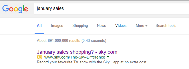 Straight away, the first thing that surprises me is the fact that Sky are the only advert showing for such a search phrase. My only explanation for this might be because most companies start their January sales in January and not straight after Christmas. Therefore, we should see the competition pick up as we enter the new year.
Looking at the advert, it is an ‘okay’ advert. I like the fact the brand name and URL ‘sky.com’ is mentioned in the advert. But, having titles start with a question is not always the best method. I do not feel induced by the title which is a sign that it does not completely work. Again, the description is the same, even with the fact it has a call to action. Call to actions generally work best when they are short and are not as long as what Sky have used.
After clicking on the above advert, I came to the following landing page: Now this is a bit of an improvement on what was just an ‘okay’ advert. Let’s go through the main positives of this landing page:
- This is an example of a hybrid landing page – it is between a product/service page and a click through landing page. This has turned out to be a successful hybridization considering that if the web user clicks on ‘Find a bundle’, they would have converted for the click through part of the landing page. If the web user does not click on ‘Find a bundle’ and simply reads the content on the landing page, they would have converted for the product/service page if digesting the information was what Sky wanted the consumer to do.
- I really like the minimalist theme Sky have used. The circles to the right and the arrow with ‘sky Go’ seemingly suggests there is content both above and below so the web user has the option to continue scrolling to read more information. This is effective as it prevents an overflow of information from appearing straight away but enables the web user to read more content than what is capable on the fold of the landing page.
My only criticism is that the links on the landing page go straight to the iTunes store or Google Play store. Since Sky are paying for traffic, you would have thought that they would want to try and keep consumers on their landing page as long as possible and not allow them to click off it onto another website that easily: even if it goes to apps for Sky.


