The last PPC campaign I analysed in the ‘Analyse A Real PPC Campaign’ series was from Hello Fresh, who had both a well designed search advert and landing page – this was particularly important for the market of subscription services since a conversion has the potential to be quite profitable in the long term.
One market that will always be in demand as long as people keep making crumbs on the floor comes with the vacuum cleaner industry. With us creeping into the holiday season, now is a time that people would also be buying vacuum cleaners, not only for themselves, but as gifts for others too. With this, here is an analysis of a PPC campaign from Shark Vacuum.
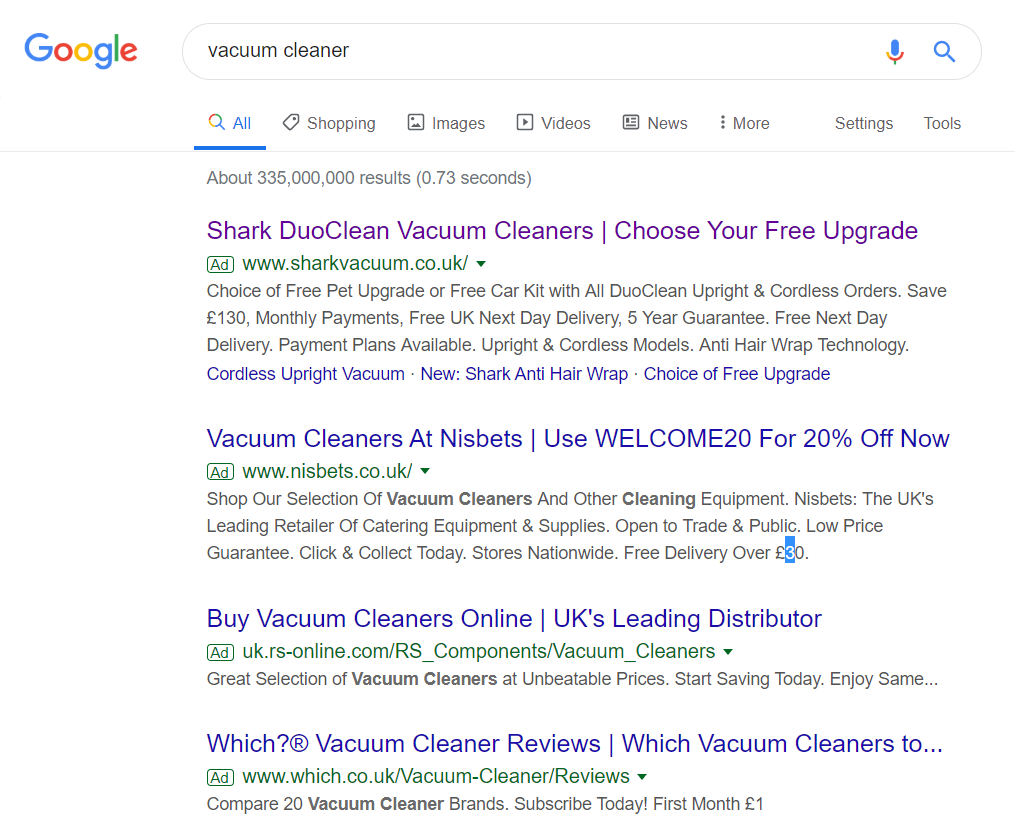
To view Shark Vacuum’s PPC search advert, I had to type into Google search UK, ‘vacuum cleaner’: Ranking number one for this search phrase either implies that Shark Vacuum have adopted a high CPC strategy or achieved a high quality score for this search phrase.
Looking at the advert itself, it has some good points to it in some areas, and bad points in others:
- The title starts with the brand name, which will help to increase the brand recognition for Shark Vacuum. As a consumer, when you think of vacuum cleaners, it is mostly between Dyson and Hoover (and possible Henry). Therefore, even if the web user does not click on the advert, it is a good idea to include the brand name at the start like they have.
- The end of the title includes a call to action, which is always a great idea in PPC. This helps to basically tell the web user what they need to do – Shark Vacuum have also included a power word ‘Free’ to further entice the web user into clicking: what free upgrade could Shark Vacuum be offering?
- The description could be seen to be either good or bad. It’s good that it is packed with different features and incentives to shop with Shark Vacuum. However, it is quite densely packed and difficult to read – remember that content that is not read by the web user in PPC is practically useless.
- The site link extension is used by Shark Vacuum, helping to increase the number of links the web user can click onto, as well as slightly increasing the size of the advert, helping to increase the advert’s exposure level.
After clicking on the above advert, I came to the following landing page: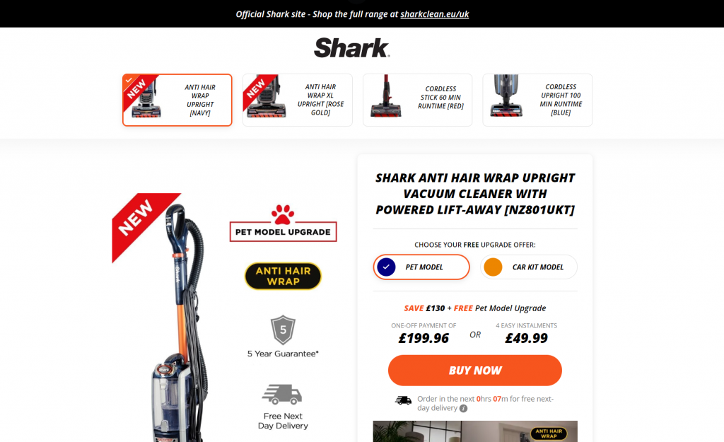 As a landing page goes, this is an example of a product/service page, with a vacuum cleaner illustrated in a to Buy now page. There are unfortunately a few issues with this page, highlighted below:
- As a theme, it is very minimalist. There is a lot of white to this page, which comes across as a bit bland. It could possibly have worked better to have more images above the fold, such as the vacuum cleaner in action, carpet going from dirty to clean or a full picture of the vacuum cleaner, possibly being used.
- The brand name/logo is in italics, which is perfectly fine. However, Shark Vacuum have decided to make a lot of the content on the page italic too (but not all). Having different types of content, font and text-transforms generally makes it harder for the web user to read, and this is a prime example of a page that does this.
- There is no navigation menu at the top, which makes it harder for the web user to explore the Shark Vacuum brand, if they should so wish – the banner at the top points the web user to the official Shark website – such a page/website would have been a better choice for PPC, since the theme contains more elements to what makes a landing page effective.