Summer is coming and with the start of the very sunny and hot World Cup in Rio, Brasil, I think it is only right to have a summer themed analysis of a PPC campaign for this article. In the last article of the ‘Analyse A Real PPC Campaign’ series, I had a look at Olay who had used their homepage as their landing page (don’t threat, though, because the homepage was a well optimised page that fitted the PPC campaign). In this article, I am only to look at PPC campaigns associated with sunglasses. From doing so, I found a campaign from ShadeStation.co.uk.
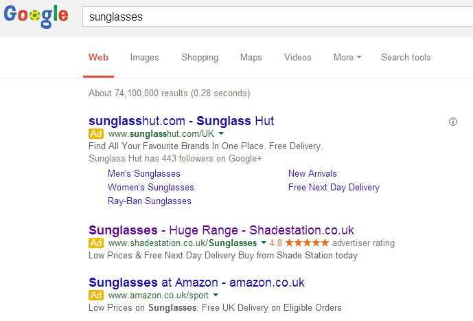
To view Shade Station’s PPC search advert, I typed into Google search UK, ‘sunglasses’:
Straight away, what I notice about Shade Station’s advert is that they have chose to use an ad extension in their advert. Ad extensions are a great way to customize and help differentiate your search advert and it has worked for Shade Station in this case. By including an advertising rating helps the web user build confidence for Shade Station. If the web user has more confidence from the 4.8/5 star rating, they are more likely to click on the advert. You see, ad extensions increase the performance of search adverts.
The only downside I have for this advert is with the description. Instead of the three phrases being separated by full stops, Shade Station chose to make it one long sentence. Full stops are great since they make the web user pause slightly emphasising what is being said. Without full stops, I feel like I am in a rush to read it.
After clicking on the following text advert, I came to the following landing page:

- Above the fold matters – On the homepage, there is a tab above the fold about finding products. For PPC, this isn’t very attractive and for this reason, it appears below the fold on the landing page version of the homepage.
- Buttons for click through – The tab on finding products is below the fold because Shade Station included two buttons on the landing page being the ‘View Men’s Sunglasses’ and ‘View Ladies Sunglasses’. These buttons kind of make the landing page a click through page now but also help to differentiate the gender of the traffic entering the landing page so that they can go to their different sections of the website.
All in all, Shade Station have a good campaign here. They want traffic but realised their homepage isn’t optimised for PPC. For this reason, they chose to make a hybrid version of their landing page that is optimised for PPC.


