
The last PPC campaign I analysed in the ‘Analyse A Real PPC Campaign’ series was from Nissan, where we never got onto analysing the landing page because the search results were so interesting! Anyway, here is a campaign that is vastly different to anything analysed in this series. In this article, we will be looking into a PPC campaign for a charity. It will be very interesting, to say the least, how charities use PPC to entice web users to donate – saying this, it is going to be intriguing to see what the campaign is like as we know exactly what the conversion is going to be for them: a donation. The campaign I will be analysing is from Save The Children.
To view Save The Children’s PPC search advert, I had to type into Google search UK, ‘charity’: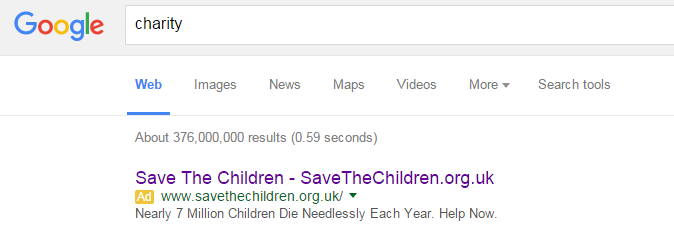 Before you ask, the reason why no other results are shown in the image is because they are organic results that show my home’s location and I don’t exactly want to publish that to the world! This does bring the point forward that Save The Children are the only charity bidding for such a keyword. Maybe it is because ‘charity’, by itself, is a bit too general and we all know that general and vague keywords usually have high CPCs associated with them (although this means there should be competition for them too which is evidently not here…)
The advert does not need to be fancy or use ad extensions. For this reason, Save The Children have done a really good job:
- The title is all about spreading brand awareness which is achieved by repeating the brand name twice, once with the URL attached.
- The description illustrates the problem and finishes with a call to action, making it seem that the web user can help by clicking onto the advert.
After clicking on the above advert, I came to the following landing page: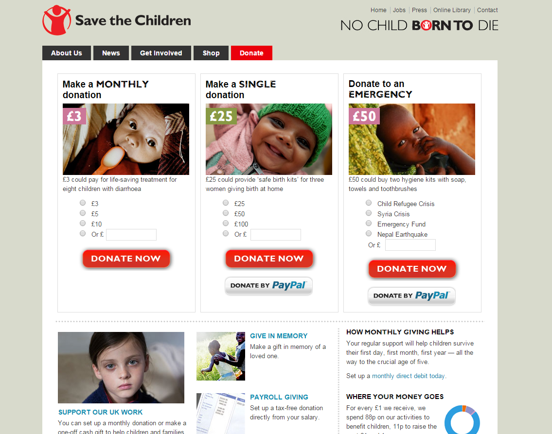 The landing page is to the point, since in order to get the web user’s attention and illustrate as clearly as possible images need to be used.
It is a click through landing page with the ‘Donate’ buttons being the buttons they are wanting to be clicked. This is made clear by them being in the prime location of the page and in red to create a sense of urgency and importance. However, it does seem a bit weird that web users cannot pay by PayPal for the £3 option and makes the landing page a little unbalanced.
What I think is effective with this campaign is the level of connection that is achieved from the web user reading each individual case with what they can help towards. In order for Save The Children to maximise the amount of donations they get, they need to touch the web user on a personal level. The touching messages, simplicity of the landing page and importance of the images all work to create such a level.


Deuros
November 21, 2015 at 2:33 pm
Quite interesting and even useful article , thanks a lot