The last campaign to be analysed in the ‘Analyse A Real PPC Campaign’ was from Euroffice who had used discounts to help attract web users into buying their water bottles. There are a few markets that will always have demand – these are the markets that companies need to be market leaders in since there will be many repetitive buying in these markets. For this reason, I am going to look at the deoderant market – everyone will need it so it is a market that companies will have to fiercely fight in to win over the loyalty and business of customers. In this article, I am going to be analysing Sanex’s PPC campaign.
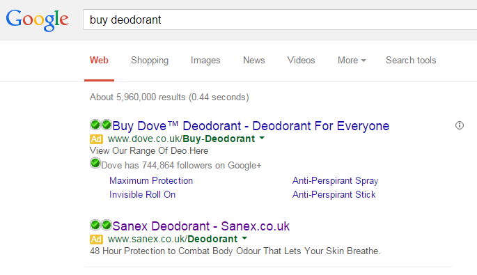
To view Sanex’s PPC search advert, I had to type into Google search UK, ‘buy deodorant’: The problem with such a keyword is that the organic search results are littered with websites that will sell a range of deodorants. This means, on these pages, Sanex will be competing against other deodorants more so based on price – if Sanex deodorant has any USPs, the main (and possibly only) way they can address these USPs is through promoting them in PPC and other forms of advertising. After all, they need to gain customer loyalty through repetitive sales.
Looking at the advert itself, The URL and title are littered with keywords and the brand name which will help the web user remember them (which is always good). I like the description as it is clear and tells the web user exactly what their product will do for them. However, it does not make me want to click onto the advert as there is no call to action (unlike Dove‘s advert just above it). At a minimum, there should always be at least one call to action in a search advert. Possibly Sanex should have used an ad extension to help improve their advert too?
After clicking on the above advert, I came to the following landing page: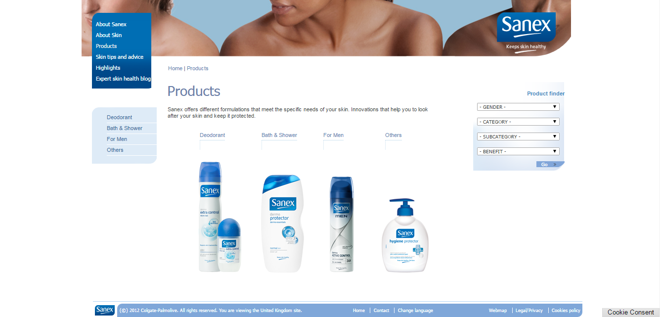 It is important the landing page looks clean to promote the product itself – this is achieved through a very minimalistic design with white as the background and tints of blue to compliment it.
From looking at the page, it is clear this is a product landing page. The objective, therefore, of this page is to promote the range of products Sanex has to offer to the web user.
I like the fact the products are in the main focus area of the landing page. However, to find out more about each product, the web user will naturally have to click onto links. Apart from clicking onto the images themselves, the size of the links Sanex have used are pretty small. In general, the bigger the link, the more likely it is going to be clicked. There is so much space on the landing page already, it makes me wonder why Sanex didn’t just make the links for their products slightly bigger: bigger than the other links on their landing page. It is clear they want the web user to browse through their products so to make this apparent to the web user, they should have made the links for the range of products the biggest text links on the page.