The last PPC campaign I analysed in the ‘Analyse A Real PPC Campaign’ series was from EE, who had targeted the newly released Google Pixel 2 smartphone to entice web users into using their network with their next contract. Considering that people don’t change networks often, it was interesting to see EE do this considering this is not a typical approach to a PPC campaign (when looking at the end conversion).
Travel insurance is something we all need, whether we are going abroad on a one hour flight or across the whole world. Therefore, without further ado, here is an analysis of a PPC campaign from Saga.
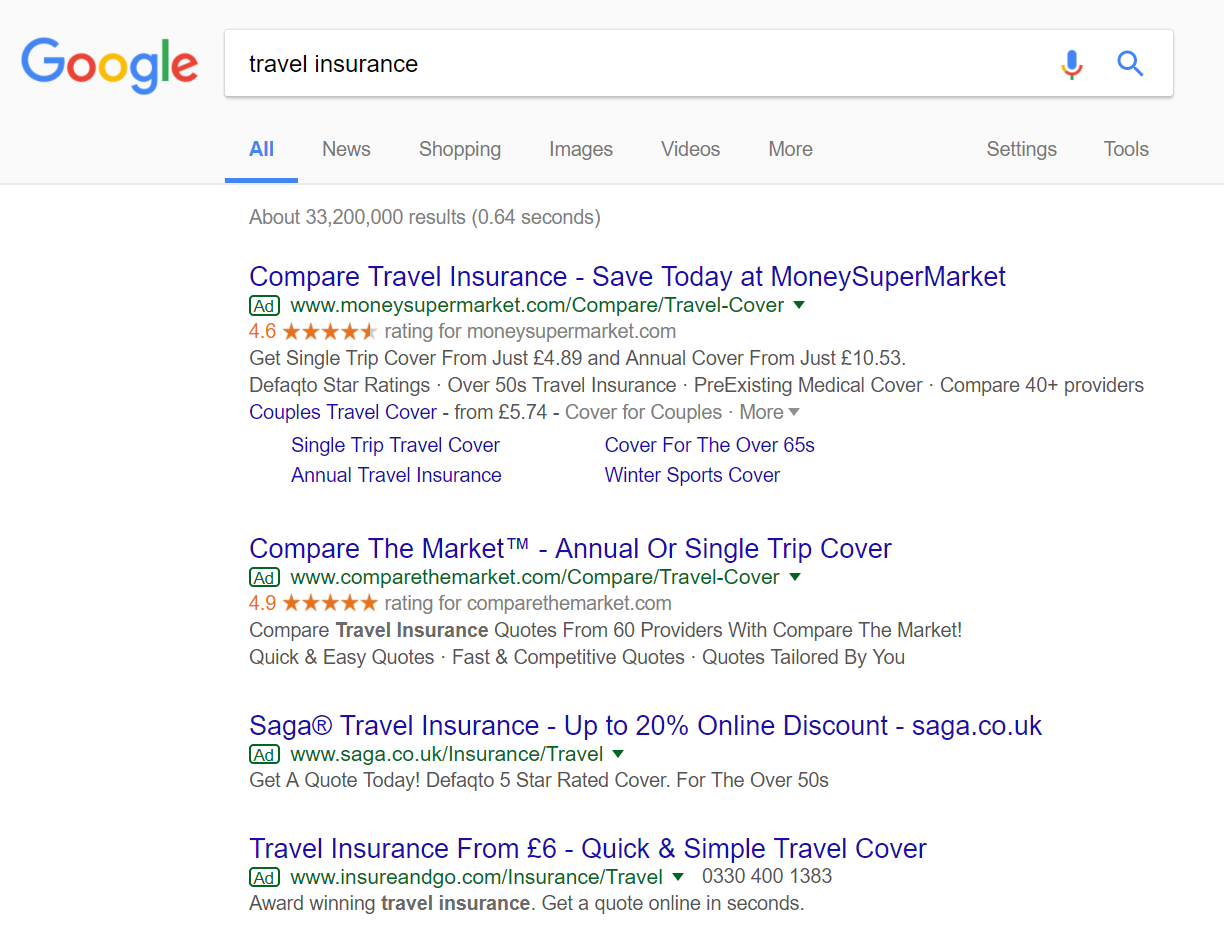
To view Saga’s PPC search advert, I had to type into Google search UK ‘travel insurance’: The competition for this search phrase is extremely high, with the maximum of four adverts appearing. Organically, MoneySupermarket rank #1 which goes to show the competition for getting clicks for this search phrase: that they have opted for a PPC campaign to re-rank themselves, ultimately, #1 again.
Looking at Saga’s advert, it is a very simple advert with the one line description and a lack of any ad extensions used. Unfortunately, this would have a slight negative impact to the performance of the advert since the real estate space of the advert is small compared to the two adverts above Saga’s. For example, if you have all four adverts displayed on your screen and you close your eyes and then quickly open them, you will naturally attract to the top two adverts rather than the bottom two.
Saying this, they have a content-heavy title including a discount through Saga and the domain name of Saga at the end, to attract direct traffic to the website. I do feel that an ad extension would have worked well to further improve the CTR of the website, such as a review or site links extension.
After clicking on the above advert, I came to the following landing page: Now this is a really really good example of a beautifully designed landing page, possibly one of the best I have seen in the series:
- Above the fold, it is extremely clean, pushing the focus to the lead capture box.
- The beach image adds to the calm and clean feel to the landing page.
- The top of the landing page has a link to the homepage (in the logo) and a number to call, if the web user would rather do it over the phone (giving the web user the freedom of an additional option).
- Below the fold contains a list of incentives and reasons to use Saga, in a style that continues the clean and minimalist look to the page.
Sometimes, it is best to keep a landing page clean and work by the ‘gone further than half way so might as well keep going approach’. By the time the web user has any doubts to using Saga, they would have invested enough time into getting travel insurance from them that they might as well continue – very clever and effective landing page.


