The last PPC campaign I analysed in the ‘Analyse A Real PPC Campaign’ series was Compare The Market, who had both strong and weak areas to their PPC campaign – the advert was cluttered in the description area but the landing page was solid and pleasant to look at with it clearly being a click through landing page. In this article, with millions of people setting and attempting to continue New Year resolutions, I thought it would be a good idea to see what pops up on Google for someone who would want to join the gym. Therefore, without further ado, here is a PPC campaign analysis from Pure Gym.
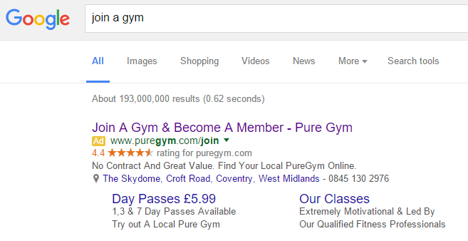
To view Pure Gym’s PPC search advert, I had to type into Google search UK, ‘join a gym’: Straight away, the first thing I notice is that this advert does not just target me based on what I searched – it also has geo-targeting too. This is essential to such an advert because it will be a complete waste of time for someone from, let’s say Spain, see this advert. Pure gym has most likely set a maximum radius for the advert to show up – beyond that radius around their gym, it is probably not worth showing an advert as the gym might be too far away to commute to it on a daily/weekly basis.
Looking at the advert itself, It is a great example of how an advert should be:
- The title is a call to action and clear, with the brand name in it too.
- The review ad extension is included to solidify the reputation of Pure Gym.
- The description is short and to the point – this is especially effective since there are so many ad extensions. A long description would have made the advert seem cluttered.
- The location extension illustrates the nearest gym for me, just in case I wanted to check out where it is on Google Maps etc.
- Finally, Pure Gym has used sitelink extensions to increase the CTR of the advert and target those that may only want to only have a daily pass to the gym or see what sort of classes Pure Gym has on offer.
But, no advert is perfect. Therefore, if I was to be picky, I would have said for Pure Gym to not include any pricing in the advert at all – most people that join gyms go for the facilities rather than the price since gyms are usually price around the same per day/month. Of course, this does depend on their marketing strategy: Pure Gym might be targeting a price sensitive market…
After clicking on the above advert, I came to the following landing page: Based on what what we just said, it is clear Pure Gym are targeting the price sensitive consumer by displaying the prices for their membership straight onto the landing page. I’ll be honest too, this is an interesting landing page for a few reasons:
- The £14.99 circle makes it seems like there is content below the fold of the page. However, after scrolling, there is absolutely nothing. This is slightly confusing why they would not simply have the full circle above the fold of the page – Pure Gym has enough space to do so.
- This is a click through landing page. The only way I can tell this is because the whole image (and I mean all of the black space, the whole image) is a link to a joining up form (lead capture). Without there being any recognizable button except for a small ‘Join Now’ button, it is unclear what the web user should click on.
The thing I am struggling with is that many people will not simply join a gym – they want to get to know the gym, found out what the facilities are like and more. For Pure Gym to assume the web user wants to join straight away from clicking on the advert is a bad move in my eyes since the web user may not be totally convinced yet to join the gym.


