The last PPC campaign I analysed in the ‘Analyse A Real PPC Campaign’ series was from Audio Jungle, who had a very well designed landing page. However considering that the description was very content heavy, it did not help the look of the search advert to also include an ad extension, being the site link extension.
With it being the time of year to show some romance, there are many advertising campaigns that are created to capitalize on loved couples buying gifts for each other for Valentine’s Day. With this, here is an analysis of a PPC campaign from Prestige Hampers.
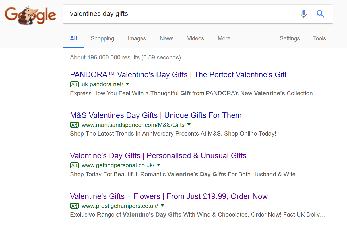
To view Prestige Hampers’ PPC search advert, I had to type into Google search UK, ‘valentines day gifts’: Prestige Hampers rank 4th in paid search results, which is about the worst position to obtain in PPC. This is because, as well as having three competitors above them, they are the closest advert to organic search results – this gives the tendency for the 4th advert in paid search result to gain advertiser block (where web users know it is an advert due to being so close to organic search results and seeing the difference).
With such a bad position, it was a good opportunity for Prestige Hampers to differentiate their advert from the competition, to enable it to stand out. This could have been achieved with the liked of a ad extension, although the fact they are the only advert with pricing, as well as the only advert offering flowers, does help too.
After clicking on the above advert, I came to the following landing page:
As a landing page does, this is an example of a click through landing page. The aim with this page is to get the web user to click onto the gift that most interests them. With this in mind, Prestige Hampers have used an effective landing page:
- There are many links and images to click onto, which no doubt will help to obtain a healthy click through (CTR) for this landing page.
- The options Prestige Hampers have presented are plentiful for the web user to find a gift they would like to explore further.
- There is a promotional code drop down from the top, making the gifts even more appealing. A call to action ‘Be Quick’ is used to inject a sense of urgency into the web user, such that this is a limited time offer. Limited time offers help to increase the conversion rate.
- There are hints of red on the landing page, which goes with the general color theme around Valentine’s day. The use of images also help to make clear this is a landing page about romance, love and gifts for those you love.


You must be logged in to post a commentLogin