The last PPC campaign I analysed in the ‘Analyse A Real PPC Campaign’ was from Eurotunnel.com, who had very good landing page that took advantage of site link extensions to make their advert larger on search engine results and a lead capture landing page to help web users find a fare for them. So now we have come on board the Eurotunnel train, the next step is to make sure we have the right currency for where we are heading off to. With this in mind, here is an analysis of a PPC campaign by Pockit: a prepaid travel currency card provider.
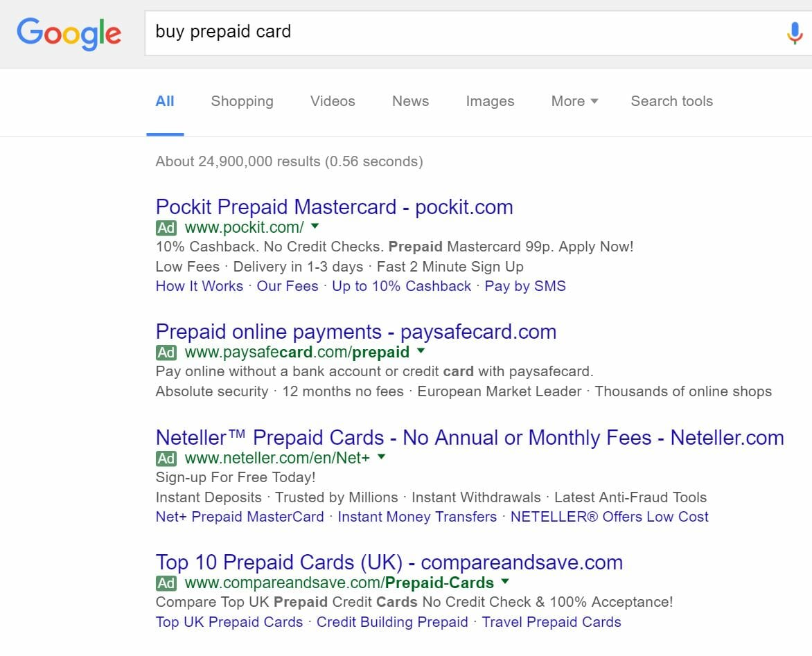
To view Pockit’s PPC search advert, I had to type into Google search UK, ‘buy prepaid card’:
Straight away, it is clear Pockit have a PPC campaign where they have adopted a high CPC in order to achieve number one ranking for paid search results (and for such a crucial keyword search phrase too).
Looking at the advert itself, it again takes a format that is common for many PPC campaigns nowadays:
- The title which addresses what the web user searched for followed by the Pockit’s URL
- A description which contains many reasons to shop with Pockit it for prepaid currency cards, with an effective call to action ‘Apply Now!’
- A site link extension is used to give web users more options to click on: if one of the site link extensions contains information for which the web user could possibly be interested in
After clicking on the above advert, I came to the following landing page:
This is a great landing page for the following below reasons:
- Images are a great element to have on a landing page and the larger the image, the better. The whole landing page is taken up with a relatively simply image of the Pockit currency card, illustrating how simple the Pockit card is.
- The navigation menu is very simply, with just four links to click onto at the top. This frees up some space at the top to make the landing page more minimalist and pleasant to look at.
- With the large ‘Join Now’ button, it is clear this landing page is a click through page. At being a click through page, it is going to be very effective because there are only eight links above the fold of the page:
- The Pockit logo
- The four navigation menu links
- The ‘Join Now’ button
- The two links to the apps on the App store and Google Play store.
- From the above links, the ‘Join Now’ link is the most noticeable which is the way it should be for a click through page.
However, the only negative point to this landing page is the link to the App store and Google Play store. It is fine telling the web user that there is an app for Pockit. However, it is pretty useless for a laptop owner to click onto these links since I am not viewing the App and Google Play store from a smartphone or tablet!


