The last campaign I analysed in the ‘Analyse A Real PPC Campaign’ series was from StubHub!, who had as what could only be described as a poor campaign in general. The use of the site link extension in the search advert was a waste and the landing page had many negative points associated to it. With the sun coming out for summer, I thought it would be a good idea to have a look at a campaign that appears for someone wanting to buy a convertible car – convertible cars appreciate in value the closer it is to summer so it will be interesting to see the competition for mid-April. Here is a PPC campaign analysis from Peugeot looking to promote their latest convertible car/s on sale.
Before we get into this, it is worth noting that I analysed a PPC campaign from Peugeot promoting the 208. It was a generally very good campaign so there are high hopes for the same to occur with this campaign.
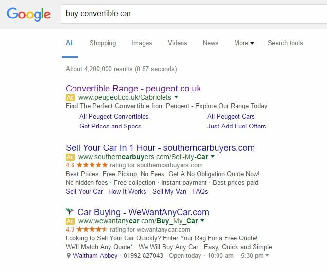
To view Peugeot’s PPC search advert, I had to type into Google search UK, ‘buy convertible car’: As expected, there is a lot of competition for such a keyword search phrase. It is clear Peugeot have adopted a campaign with the highest CPC from the fact they are ranked #1 on paid results – a prime area to get the highest click through rate from and best results.
I think the search advert Peugeot used is pretty much spot on. The web user (being myself) has not specified a convertible car – Peugeot advertise that they have a range of convertibles to browse through which will help to target more people increasing the CTR of the advert. The domain name is mentioned, there are two call to actions in the description and the site link extensions are used to their full advantage linking the web user to four different pages all unique from each other (unlike what StubHub! had done). So, all in all, a great example of how a search advert should be made.
After clicking on the above advert, I came to the following landing page: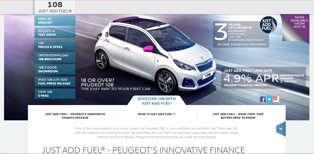 As expected, this is a good example of a landing page due to the following reasons:
- Images are a thousand words. The image Peugeot has used is vibrant and shows off the car in all its glory.
- The navigation menu which displays more information about the car is displayed not at the top but to the left and displays all of the necessary information the web user may want to click onto involving the car.
- The title ‘JUST ADD FUEL’ is displayed just above above the fold to encourage the web user to scroll down to view more information – a great way to get the web user to scroll down.
However, the landing page is only ‘good’ and not ‘great’ because:
- Is that car a true convertible, as what the web user was wanting to buy?
- There is only one car on display, not a ‘range’ as was stated in the advert.
- The car has pink mirrors – the car does not seem to be targeted at men as much as it is at women: the landing page should be unisex.
- There seems to be just a tad too much information around the image of the car that makes the landing page look a little cluttered.


