The last PPC campaign I analysed in the ‘Analyse A Real PPC Campaign’ series was from OnTheMarket.com, who had a very good search advert and a relatively good landing page which followed off from where the search advert finished – the only bad point was that the landing page could have been more optimised for the PPC traffic, which it did totally seem like it was.
With many new phones coming out around this time of year in preparation for the holiday season, it will be interesting to see the competition for someone wanting to buy a new phone. Therefore, without further ado, here is an analysis of a PPC campaign from OnePlus.
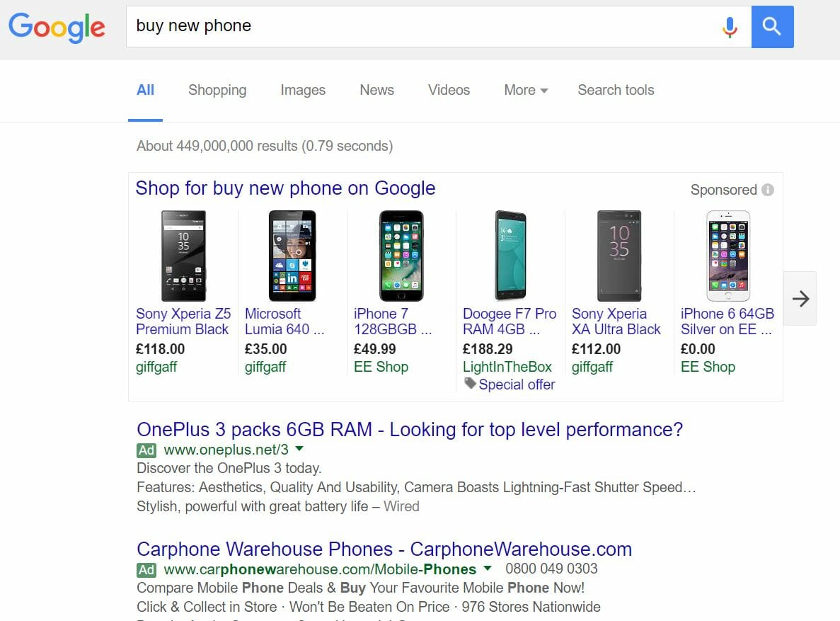
To view OnePlus’s PPC search advert, I had to type into Google search UK, ‘buy new phone’: The competition for such a search phrase is fierce and not surprisingly either. Google shopping sponsored results dominate the top of the search results with OnePlus’s search advert being the top of paid search results for PPC. We can expect, for this reason, that OnePlus have a higher CPC than the Carphone Warehouse.
Looking at the advert itself, it is very effective for OnePlus to ask such a question in the title of their search advert ‘Look for top performance?’ – naturally, the web user will be so will be more inclined to click onto the advert.
The rest of the advert then features a call to action, features of the phone and a quote from Wired about the phone. On the whole, this is a very good advert. However, the only criticism I have is that I feel the call to action could have been given more exposure: possibly in the title. Back to back testing for OnePlus could tell them if swapping the CTA in the top line of the description with the question in the title would provide better results for them.
After clicking on the above advert, I came to the following landing page: This is a very effective landing page for the following below reasons:
- The colour theme is colourful but doesn’t overpower the landing page with it being white and red.
- The navigation menu at the top expands its options upon hovering over it, enabling more areas of the website to be viewed upon the web user’s request.
- The central area of the landing page is taken up with a large image of the phone, with the name of the phone and one of its features in the bottom left corner. This is a very effective way to get web users to want the phone since it advertises the phone as something very desirable having it photographed in the way that it has been here on this landing page.
- The fact that half of the phone is displayed above the fold of the page and the rest is displayed below the fold will encourage web users to scroll below the fold of this landing page, enabling the web user to see more information about the phone to entice them further.


