The last PPC campaign I analysed in the ‘Analyse A Real PPC Campaign’ series was from QuoteSearch, who had a good search advert, similar to competition for the search phrase and an extremely well designed landing page.
With OnePlus recently announcing their new flagship smartphone for 2017, never is it a better time to see how they are trying to spread the awareness for their new flagship in order for people to hear about it to purchase it. Therefore, without further ado, here is an analysis of a PPC campaign from OnePlus to promote the OnePlus 5.
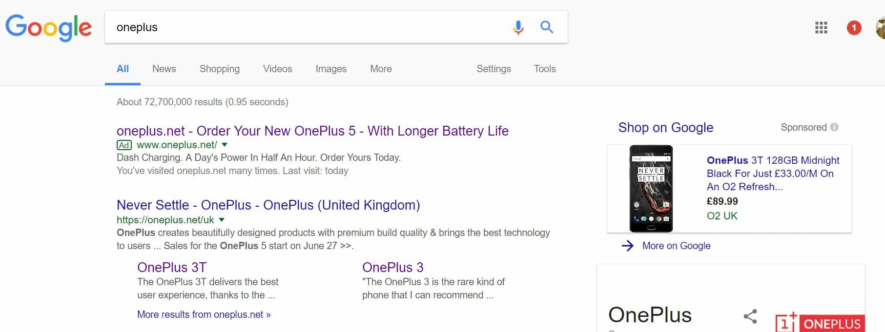
To view OnePlus’s PPC search advert, I had to type into Google search UK, ‘oneplus’: Straight away, it is interesting why OnePlus chose to even create a PPC campaign for this search phrase since they rank organically number one already. However, there is a clear reason why this is the case. The organic number one result points the web user to the homepage of OnePlus, which is a generic page with an image of the OnePlus 5. The PPC search advert points the web user to the OnePlus 5 product page, which contains an extra navigation menu with all of the features to know about that is on the OnePlus 5. Therefore, it can be seen that OnePlus wanted to reduce the number of clicks the web user had to do in order to view their newly released smartphone.
Looking at the advert itself, the advert is very much about promoting the OnePlus 5 with a nice call to action in the title and features in the description. However, I would have seen it to be better to have the domain name at the end of the title and not at the start, so that the CTA about ordering the OnePlus 5 and the battery enticement is read and engaged with first.
After clicking on the above advert, I came to the following landing page: This is an exceptional landing page, which takes many pointers from Apple (even including the design of the rear of the phone)! Below are the main positive areas to this product page:
- The whole design of the landing page is deliberately minimalistic to direct all attention to the image of the OnePlus 5.
- Due to the fact you cannot see the whole smartphone, the web user is inclined to scroll down to view the rest of the smartphone, which sparks off beautiful animations to go through the various features of OnePlus 5.
- Both navigation menus (one for the actual website and one for the OnePlus 5) are clean and minimalistic in their design. This pushes any attention away from these menus and to the image of the smartphone.
However, the best bit about this phone is the fact that the navigation menu for the product is fixed, which means that it stays attached to the top of the web browser even after scrolling below the fold. This is extremely effective since the conversion button, being ‘Subscribe’ which will later change to ‘Buy Now’ when the phone is released, is always in sight and clickable on this landing page.


